TASK MANAGER REDESIGN
UX/UI
The task table is not only a way for team members to manage their own to-dos, but also a shared communication layer between operations and sales. As task volumes grew, users were managing hundreds of items per day, leading to excessive scrolling, manual workarounds, and fatigue. This created friction in a tool that should have supported speed, clarity, and focus.
This use case is divided in 6 parts: analysing the problem, discovery, problem statements, design strategy, adoption & rollout, and iteration & learnings.
Medbelle
Product designer
ROLE
COMPANY
OUTCOME
SCOPE
Improved scannability, prioritisation, and task handling efficiency; gradual but successful adoption of a new task view
UX · UI · Internal tools · Operations & Sales

01|06
THE PROBLEM
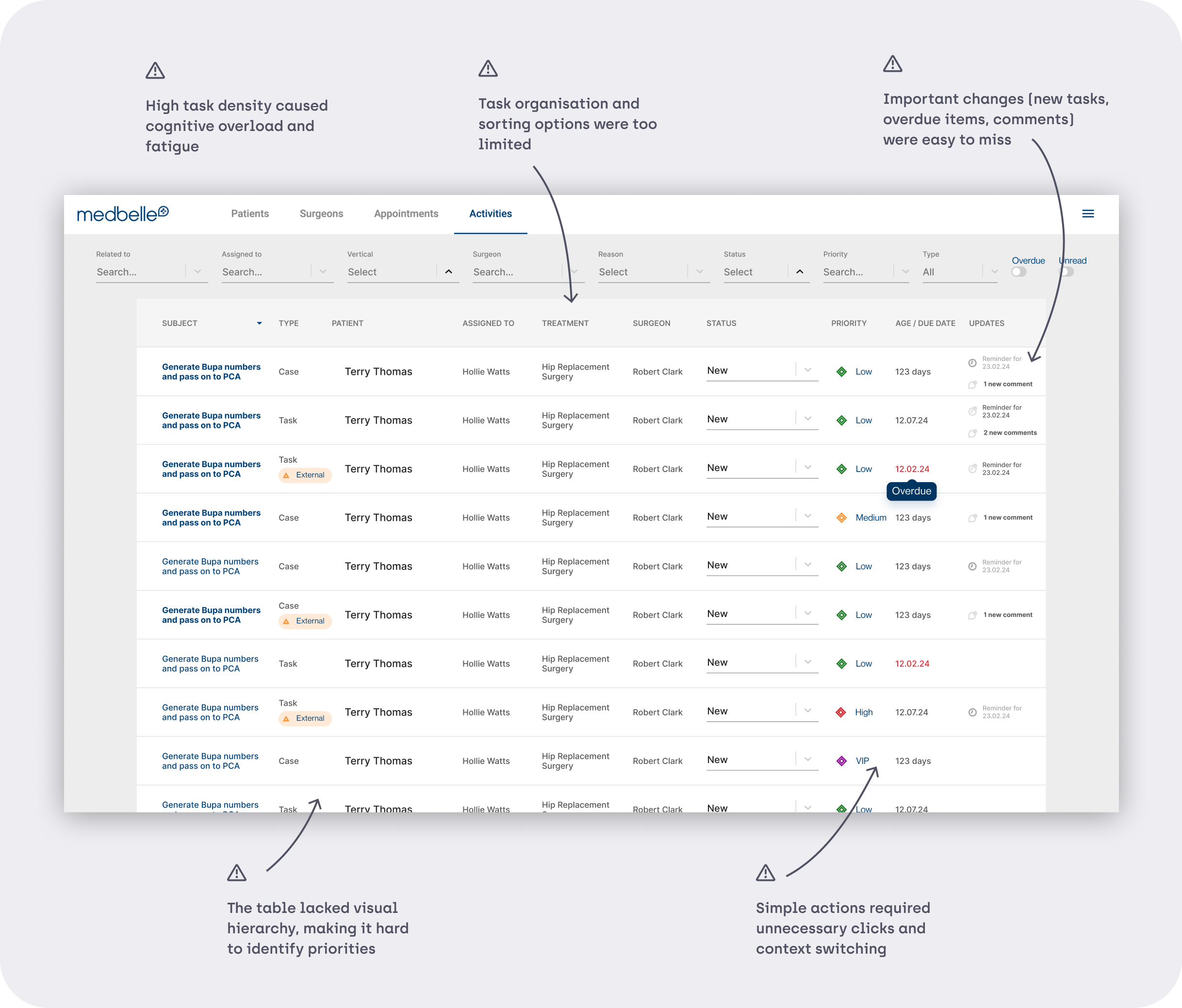
The task table view was a mission-critical surface used daily by operations and sales teams, yet it was visually dense, difficult to organise, and inefficient to use at scale.
02|06
DISCOVERY
SHADOWING & OBSERVATION
To understand real usage patterns, I shadowed multiple team members across operations and sales during their daily workflows.
Key observations
Users spent a significant amount of time scrolling up and down the table
Tasks were frequently re-checked due to lack of visual prioritisation
Some users took screenshots or exported tasks into spreadsheets to organise their day
Important or new tasks were easy to miss
The table was used continuously throughout the day, amplifying even small inefficiencies
COMPETITOR ANALYSIS
I analysed task management and productivity tools with a strong focus on dense, high-volume task handling.
Key patterns identified
Compact, information-dense layouts that surface priority at a glance
Visual grouping of tasks into meaningful sections
Card- or section-based organisation for reducing cognitive load
Clear distinction between what’s new, what’s due, and what needs attention
Day-based organisation (e.g. Today, Tomorrow) to support daily planning
These insights directly informed decisions such as section-based grouping and the introduction of a day-oriented task view.
03|06
PROBLEM STATEMENTS
SHADOWING & OBSERVATION
From discovery and analysis, the core problems became clear:
04|06
DESIGN STRATEGY
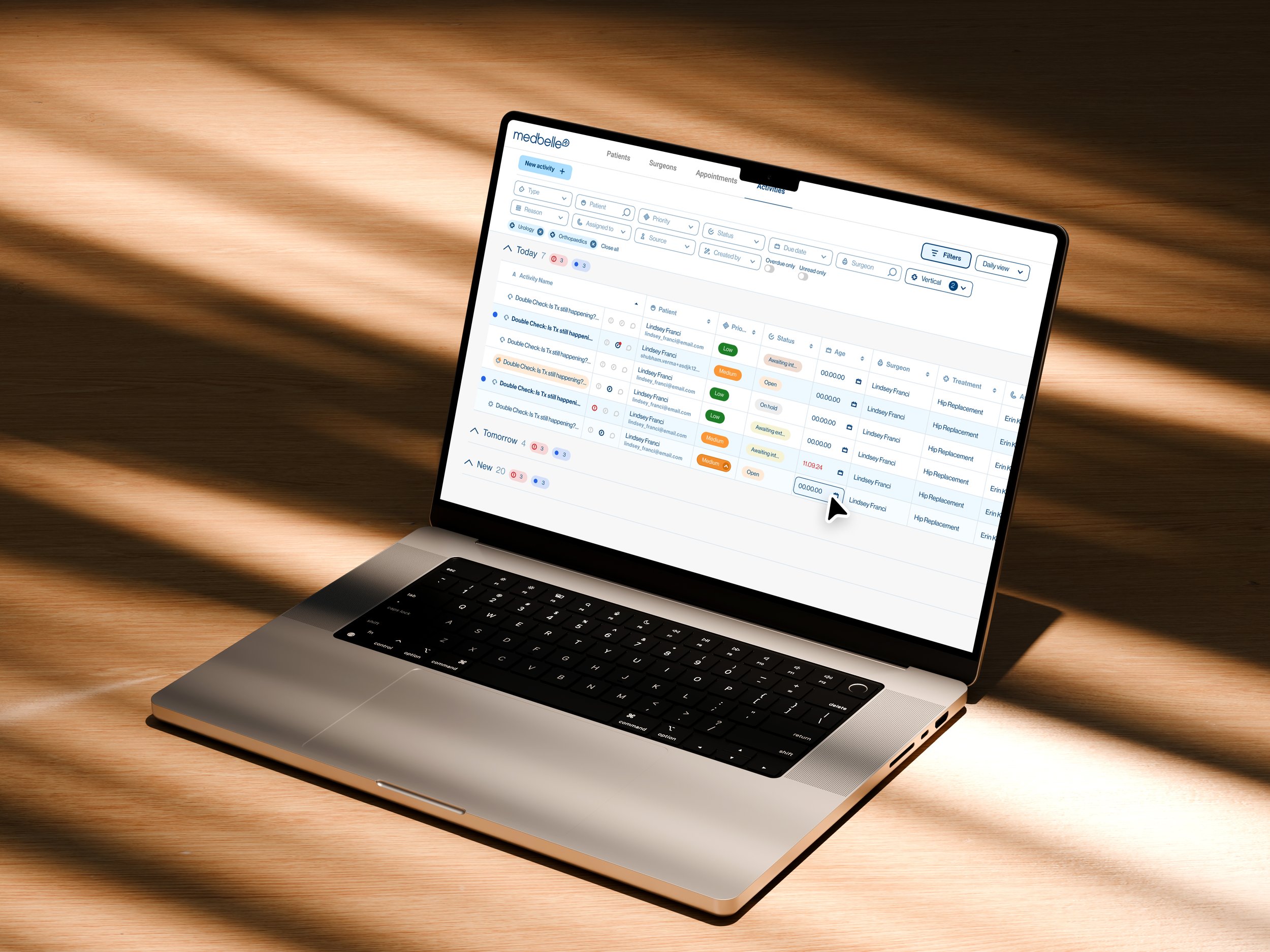
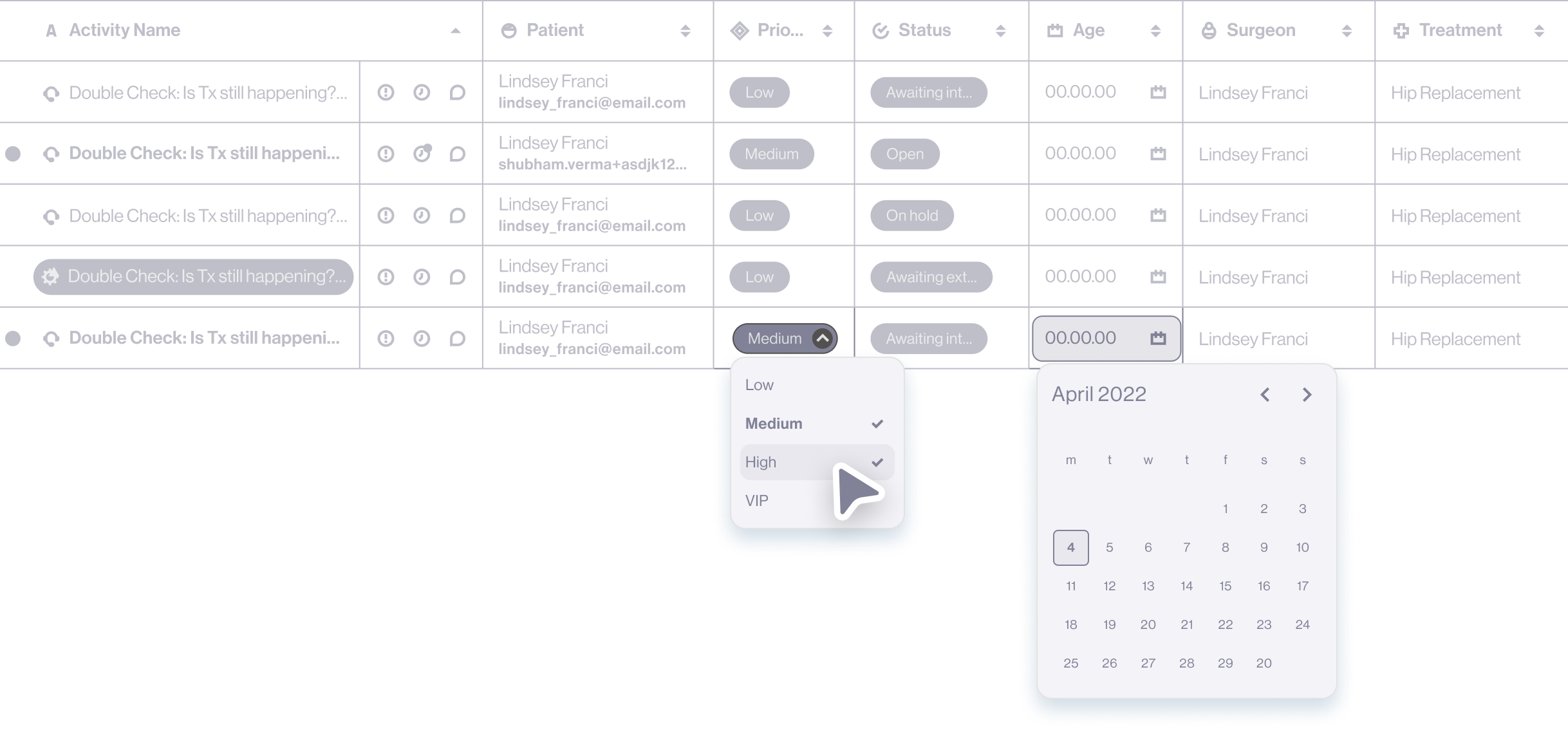
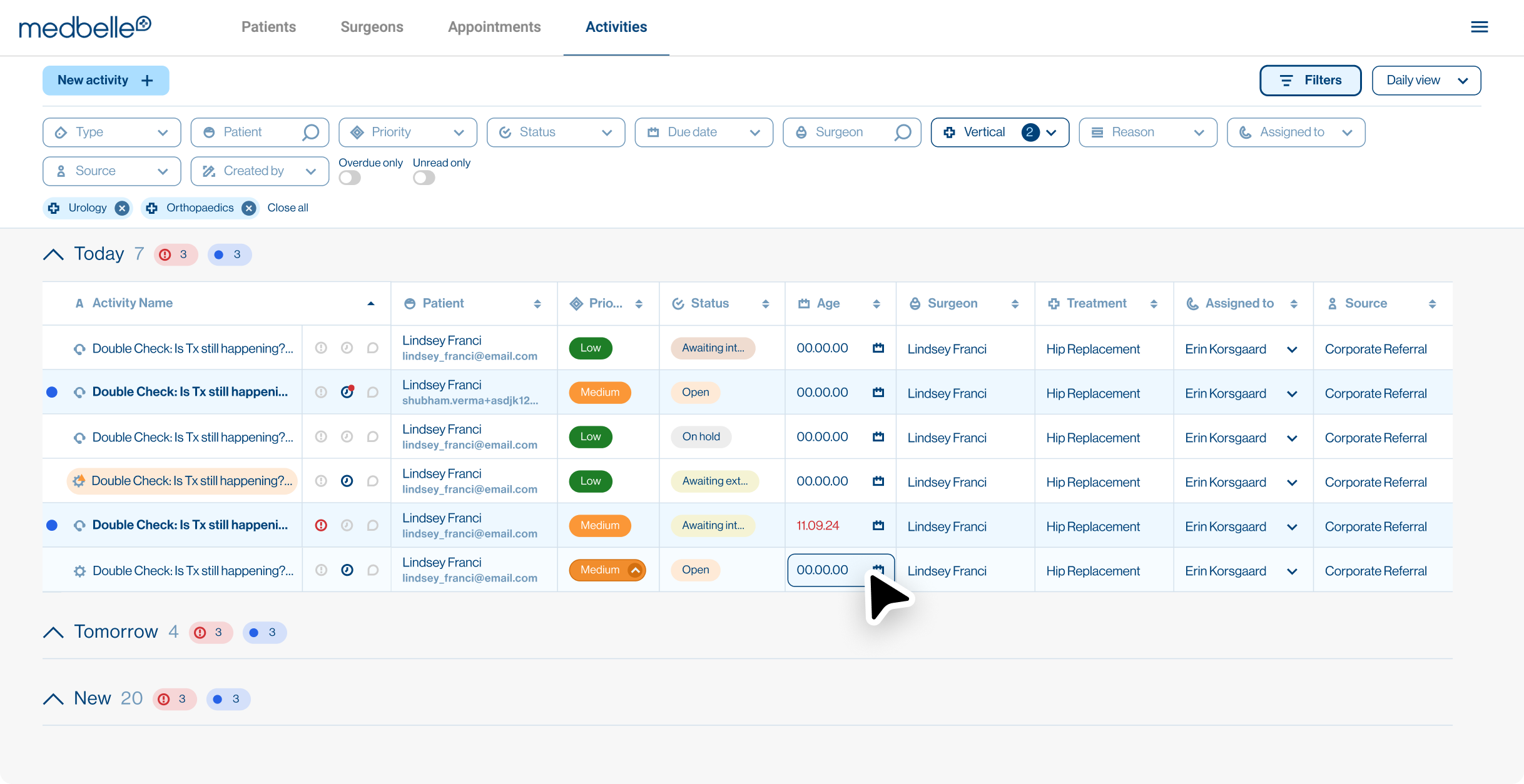
1. COMPACT, SCANNABLE TABLE LAYOUT
Reduced vertical density to surface more information at once
Optimised spacing to minimise scrolling without sacrificing readability
2. FLEXIBLE SORTING AND FILTERING
Enabled ascending/descending sorting per column
Allowed multi-select filters with clear visibility of active filters
Made filters easy to remove individually or reset entirely
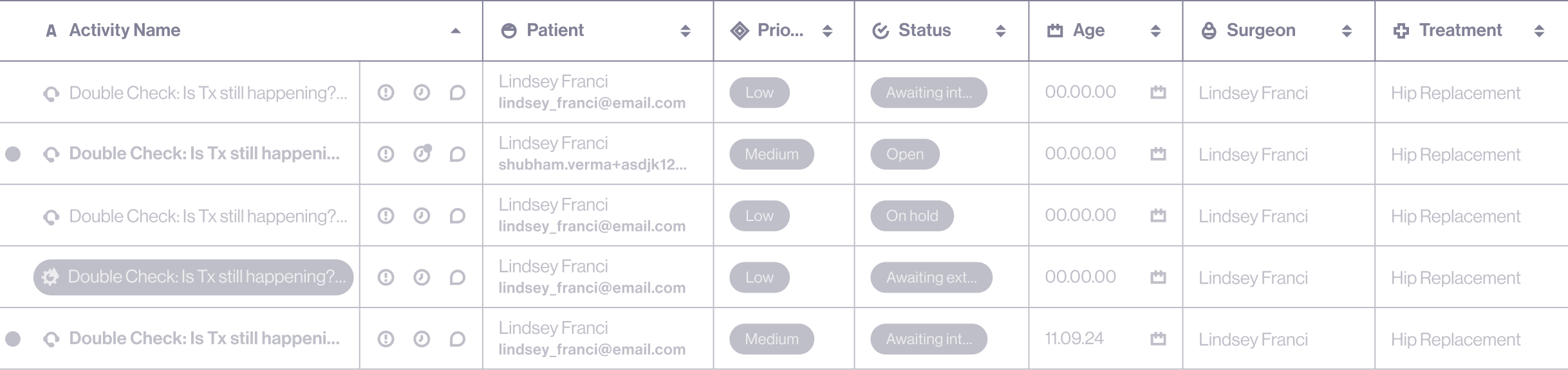
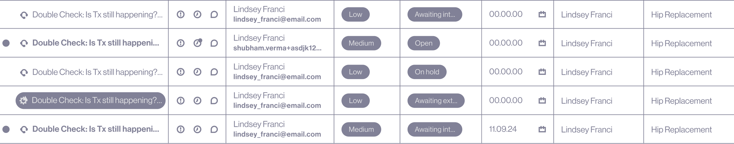
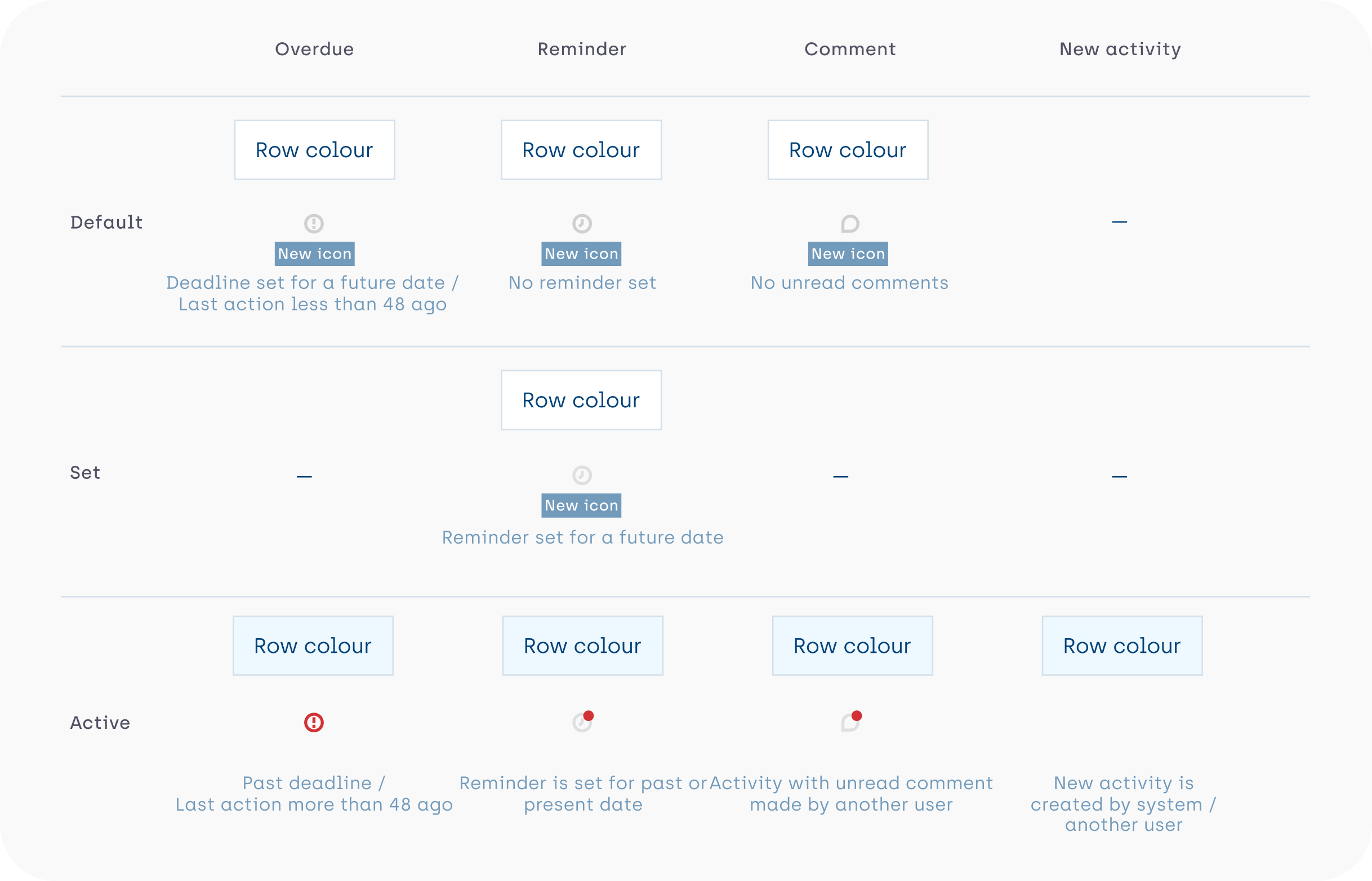
3. STRONG VISUAL PRIORITISATION
Introduced clear indicators for new, overdue, and updated tasks
Highlighted items requiring attention directly within the table
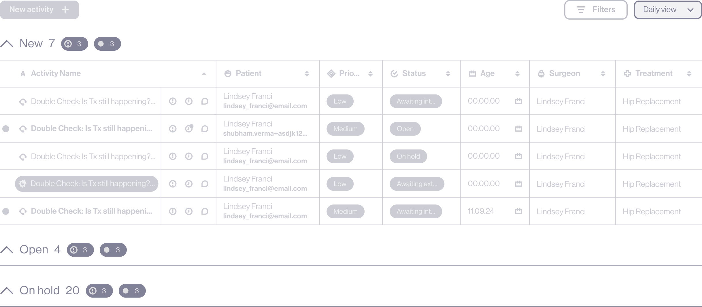
4. SECTION-BASED TASK GROUPING
Organised tasks into meaningful, collapsible sections
Displayed indicators per section to show new or overdue items
Allowed users to collapse sections while still seeing what needs attention
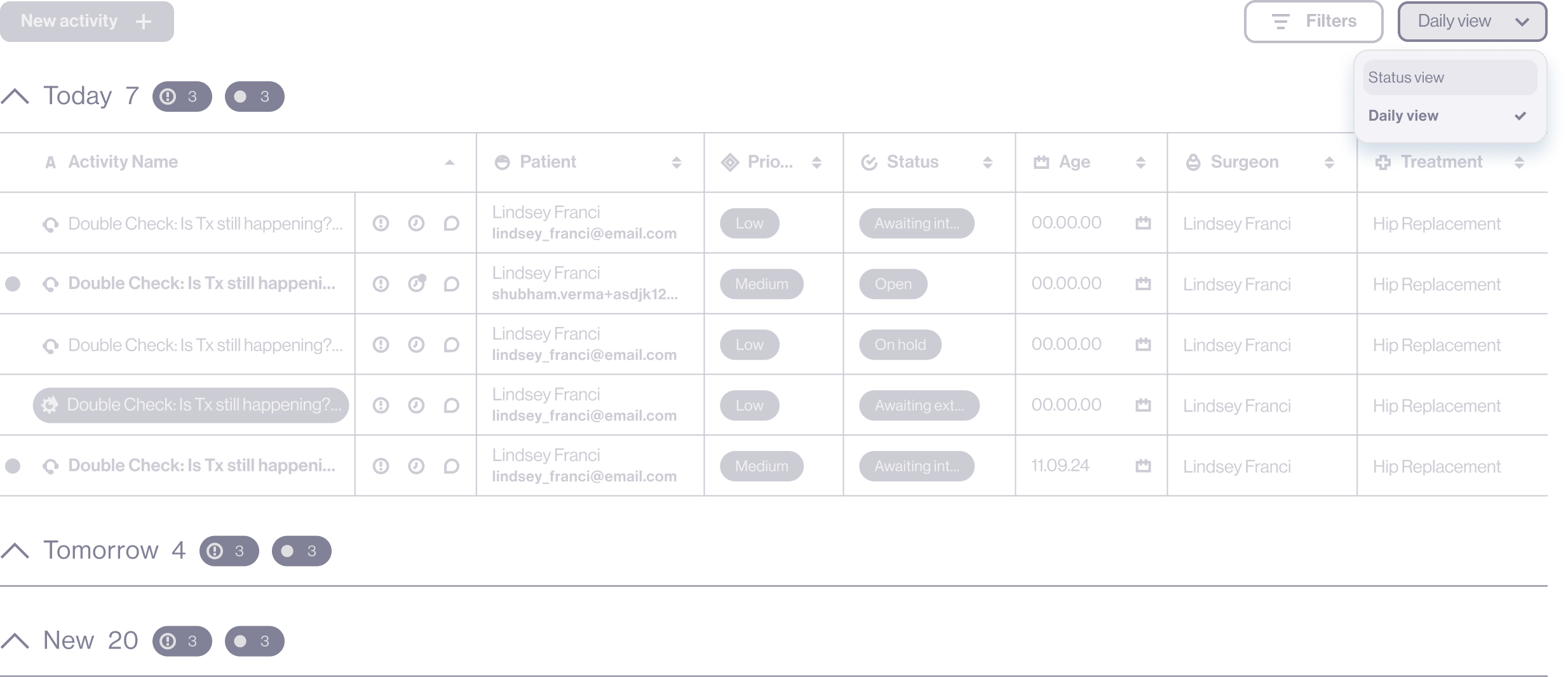
5. NEW DAY-BASED TASK VIEW
Introduced a dedicated view separating tasks into Today, Tomorrow, and New
Supported daily and weekly planning with minimal manual effort
Ensured important tasks were not lost through automated grouping logic
6. INLINE EDITING FOR SPEED
Enabled editing of key task attributes directly from the table
Reduced the need to open individual tasks for common updates
Saved time and clicks in a high-frequency workflow
The final design introduces a compact, highly scannable task table that helps users prioritise work at a glance, reduce unnecessary scrolling, and act quickly on what needs attention. By combining visual indicators, flexible organisation, and inline editing, the table was redesigned to better support high-volume, day-to-day operational workflows.

05|05
ADOPTION & ROLLOUT
The new view was introduced alongside the existing one, allowing users to switch at their own pace rather than forcing an immediate change.
Key observations
Initial preference for the familiar view
Gradual migration as users became comfortable with the new layout
Increased adoption driven by day-based organisation and reduced scrolling
Ongoing refinements based on real team feedback
06|06
ITERATION & LEARNINGS
Feedback sessions with stakeholders and team members helped identify which ideas added real value and which felt unnecessary or gimmicky. Several elements were refined or removed, reinforcing the importance of testing changes within real workflows.
Delivering multiple interaction and structural changes in one phase increased complexity for development and QA. A phased rollout would have enabled better testing, quality control, and smoother iteration.
Key observations
Small efficiency gains matter greatly in high-frequency tools
Adoption improves when users retain a sense of control
Internal tools benefit from the same UX rigour as customer-facing products