SURGEON PROFILE REDESIGN
UX/UI
Patients often arrive on surgeon profile pages with a clear goal: to quickly understand whether a consultant is right for them and to book an appointment with confidence. On the Medbelle website, these pages were not meeting that need — they were visually outdated, difficult to scan, and offered no clear path to action. This project set out to redesign the surgeon profile experience to prioritise clarity, usability, and conversion, while creating a more compelling and valuable presence for surgeons on the platform.
This use case is divided in 5 parts: analysing the problem, goals, competitor analysis, design strategy and validation.
Medbelle
Product designer
ROLE
COMPANY
OUTCOME
SCOPE
Improved clarity, engagement, and perceived value; strong surgeon adoption and positive feedback
UX, UI, CRO, SEO considerations

01|05
THE PROBLEM
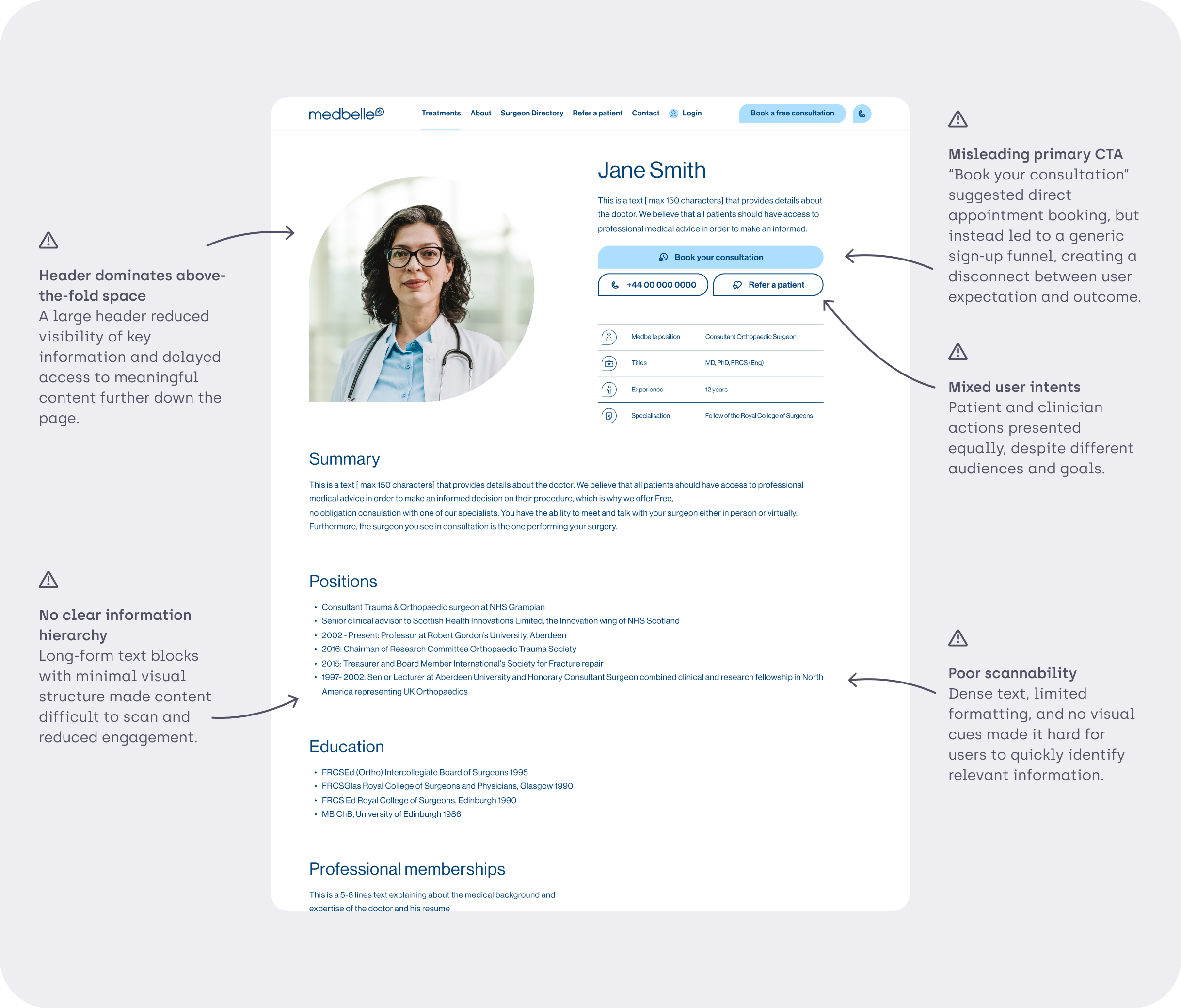
Patients landing on surgeon profile pages struggled to quickly find relevant information or confidently book an appointment due to poor hierarchy and unclear user journeys
Poor information hierarchy for patients
No booking capability despite high-intent traffic
Low engagement and no conversion optimisation
Negative feedback from surgeons themselves
02|05
GOALS
USER GOALS
Quickly assess if a surgeon is relevant
Understand availability, locations, insurance compatibility
Book without friction
BUSINESS GOALS
Convert organic traffic into bookings
Increase surgeon satisfaction and retention
Strengthen Medbelle’s marketplace credibility
DESIGN PRINCIPLES
Information at first glance
Progressive disclosure over content dumping
Modular and data-aware layout
Conversion visible at all times

03|05
DISCOVERY & COMPETITOR ANALYSIS
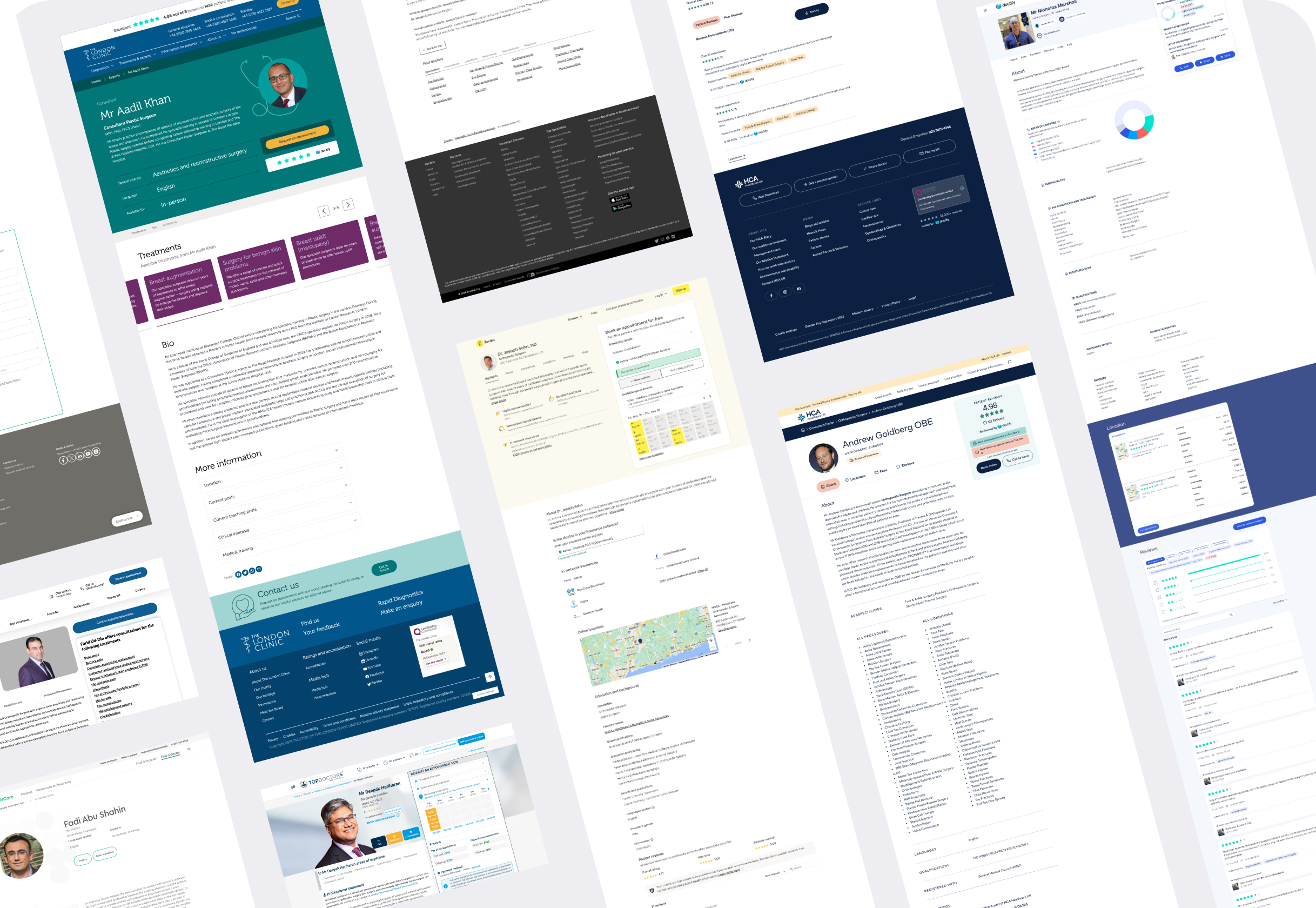
I analysed competitor surgeon profile pages in similar healthcare platforms to identify effective patterns and common usability issues around content structure, trust signals, and booking actions.
POSTIVE PATTERNS EXTRACTRED
-
Made it easier to recognise different content areas at a glance, reducing the need to read section titles in detail.
-
Served as strong trust signals and supported decision-making.
-
Persistent booking actions (especially sticky CTAs) supported high-intent users and reduced friction.
-
Helped users quickly assess coverage compatibility without additional research.
-
Clear, easy-to-find forms lowered the barrier to contacting or booking a consultant.
-
Visual indicators (e.g. experience, specialisation) surfaced key information without adding text-heavy content.
-
Jump links helped users navigate long pages efficiently and find relevant information faster.
-
Valuable for accessibility and inclusivity, particularly for international patients.
NEGATIVE PATTERNS EXTRACTRED
-
Some profiles attempted to surface too much information at once, resulting in poor visual hierarchy and reduced scannability.
-
Key information and secondary details often competed for attention, weakening the overall user journey.
04|05
DESIGN STRATEGY
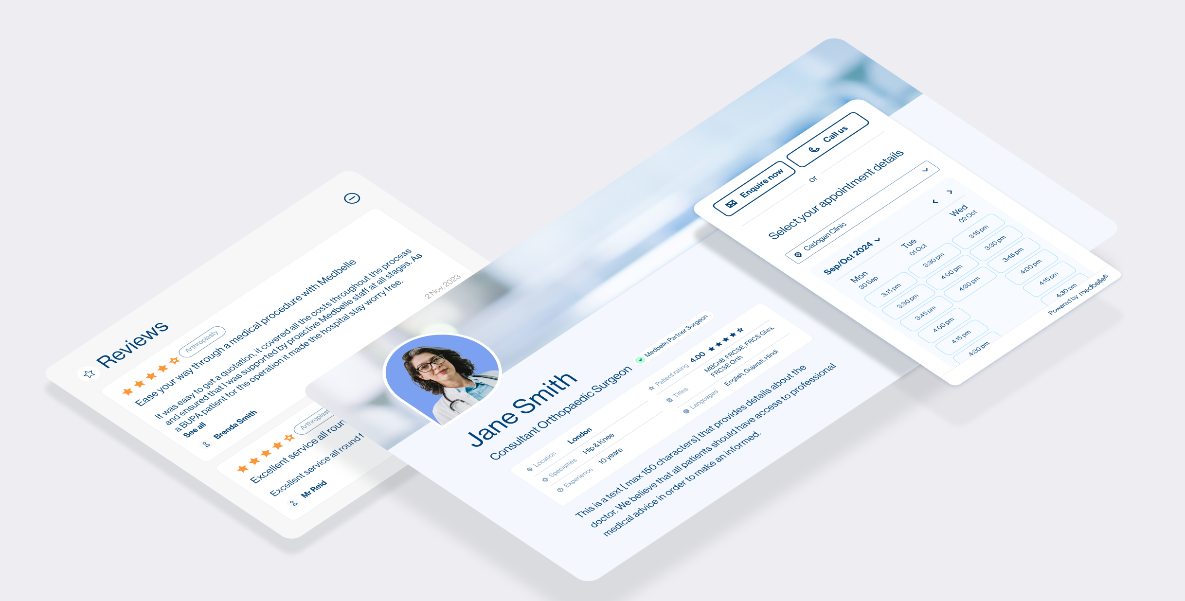
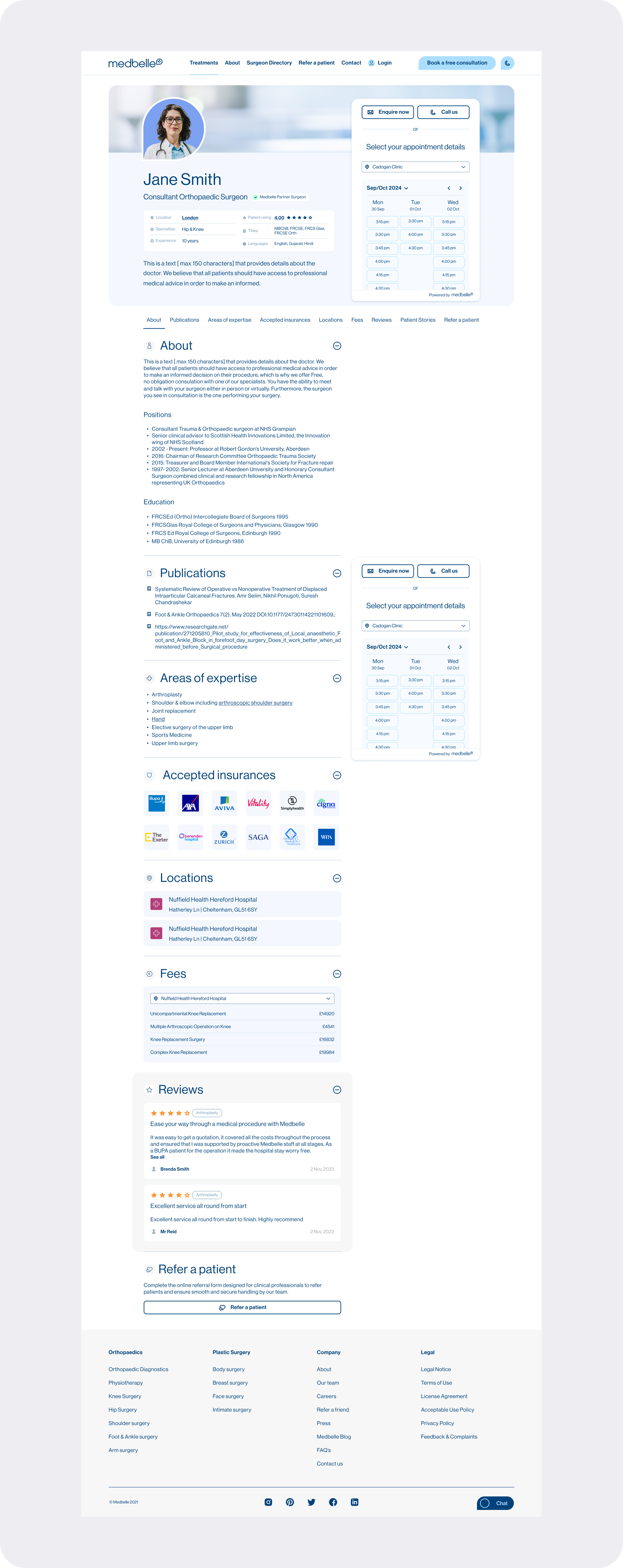
1. COMPACT, INFORMATION-DENSE HEADER
Reduced visual dominance of headshots
Surfaced key stats immediately (speciality, locations, ratings)
Ratings, locations, insurers link to their sections
2. STICKY CTAS AS A CONSTANT AFFORDANCE
Introduced always-visible CTAs to support high-intent patient actions
Prioritised patient-facing actions, while deprioritising secondary CTAs (e.g. Refer a patient) to avoid competing calls to action
3. MODULAR CONTENT BLOCKS
Reduced visual dominance of headshots
Surfaced key stats immediately (speciality, locations, ratings)
Ratings, locations, insurers link to their sections
4. CLEAR HIERARCHY THROUGH PROGRESSIVE DISCLOSURE
Structured content into clearly defined, scannable sections
Used visual hierarchy, colour, and icons to guide attention and support quick scanning
Added a sticky section menu with quick links to allow users to jump between key areas of the page
5. EXPANDABLE AND COLLAPSIBLE CONTENT SECTIONS
Introduced the ability to expand or collapse sections to reduce content overload
Enabled future testing to identify which sections are most relevant to users
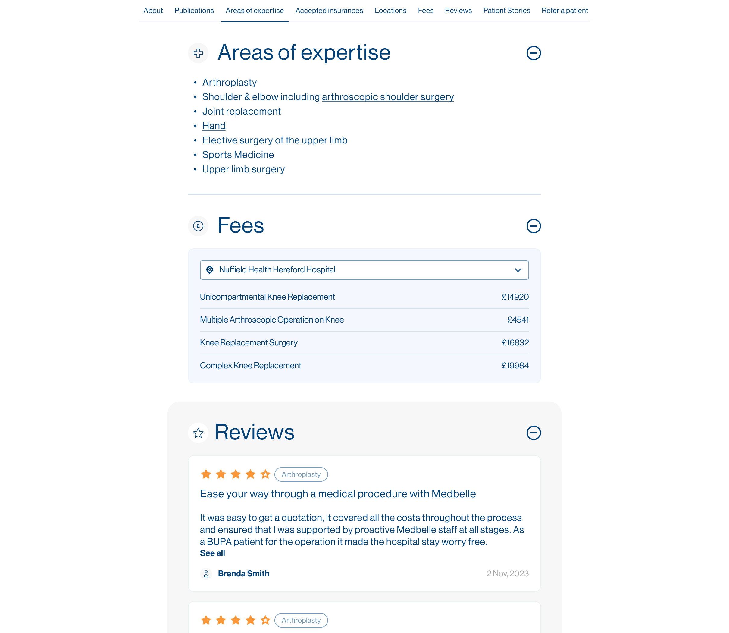
6. NEW DECISION-SUPPORT SECTIONS
Introduced Reviews and Surgeon Fees sections to increase transparency
Enabled patients to make more informed and confident decisions
Reduced uncertainty and friction in the booking journey
The final design transforms the surgeon profile from a static content page into a goal-driven product surface. By introducing clear hierarchy, modular sections, and persistent access to key actions, the layout supports faster decision-making and a more confident booking experience for patients.
05|05
ITERATION & VALIDATION
VALIDATION METHODS USED
Internal reviews with product & stakeholders
Direct qualitative feedback from surgeons
Adoption signals (requests for profiles, additional content)
OUTCOME
Surgeons responded extremely positively, with some actively requesting profiles or asking to enrich their pages further, a strong signal of increased perceived value and trust.