GOALSTER MOBILE APP 2.0
UX/UI | Branding
Goalster is a mobile app to translate a leadership expert’s experience in career development into a personalizable digital parter that helps users achieve their career and life goals. A few years back, I’ve designed the first version of Goalster (see use case) and now the client came back with a bigger budget giving me the opportunity to revisit all the app look and functionality and give it a fresher mood and improve its usability.
This use case is divided in 5 parts: analysing the problem, user research, user flows, wireframes and visual design.
My role
Design strategy
Research
Competitor analysis
User flow
Information architecture
Wireframes
Prototyping
Visual design
Tools
Sketch
Adobe Illustrator
01|05
ANALYSING THE PROBLEM
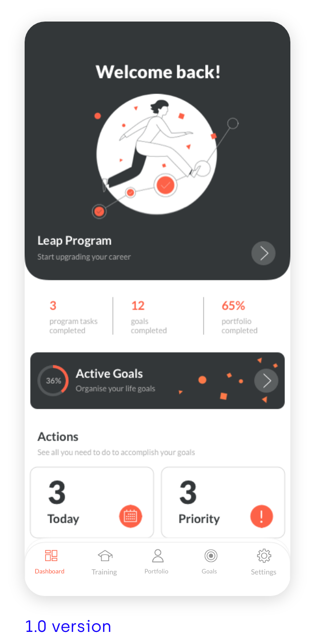
The client came to me to freshen up Goaslter’s look I’ve created a couple of years ago. These were the first problems I encounter straight way.
PROBLEMS
Lack of an ownable look
Some screens are too dark, not engaging
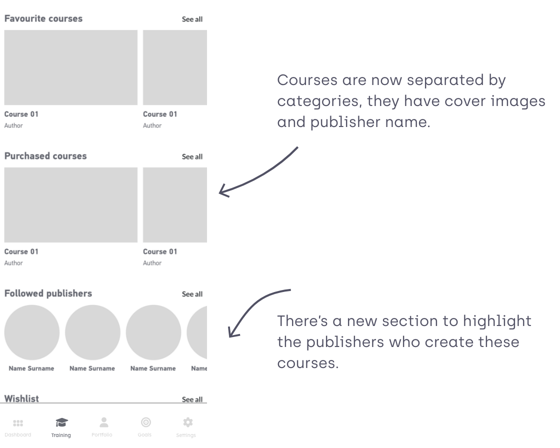
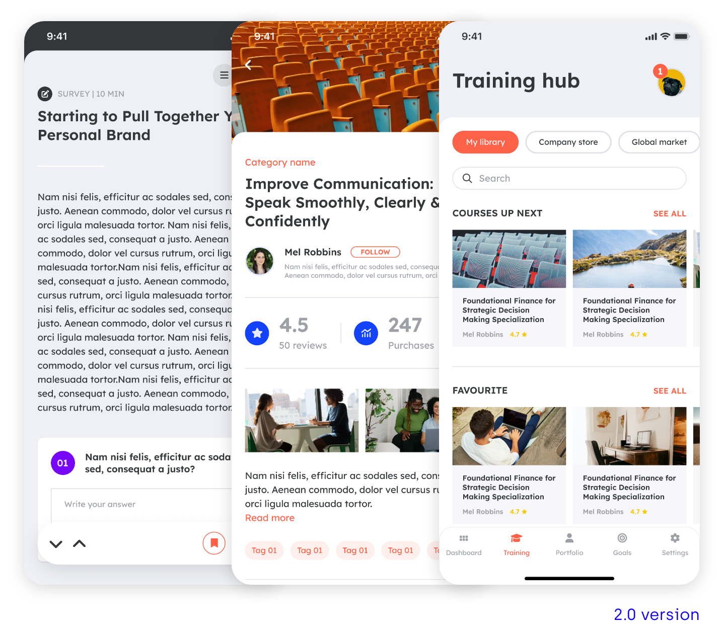
New features to be added to the Training hub section
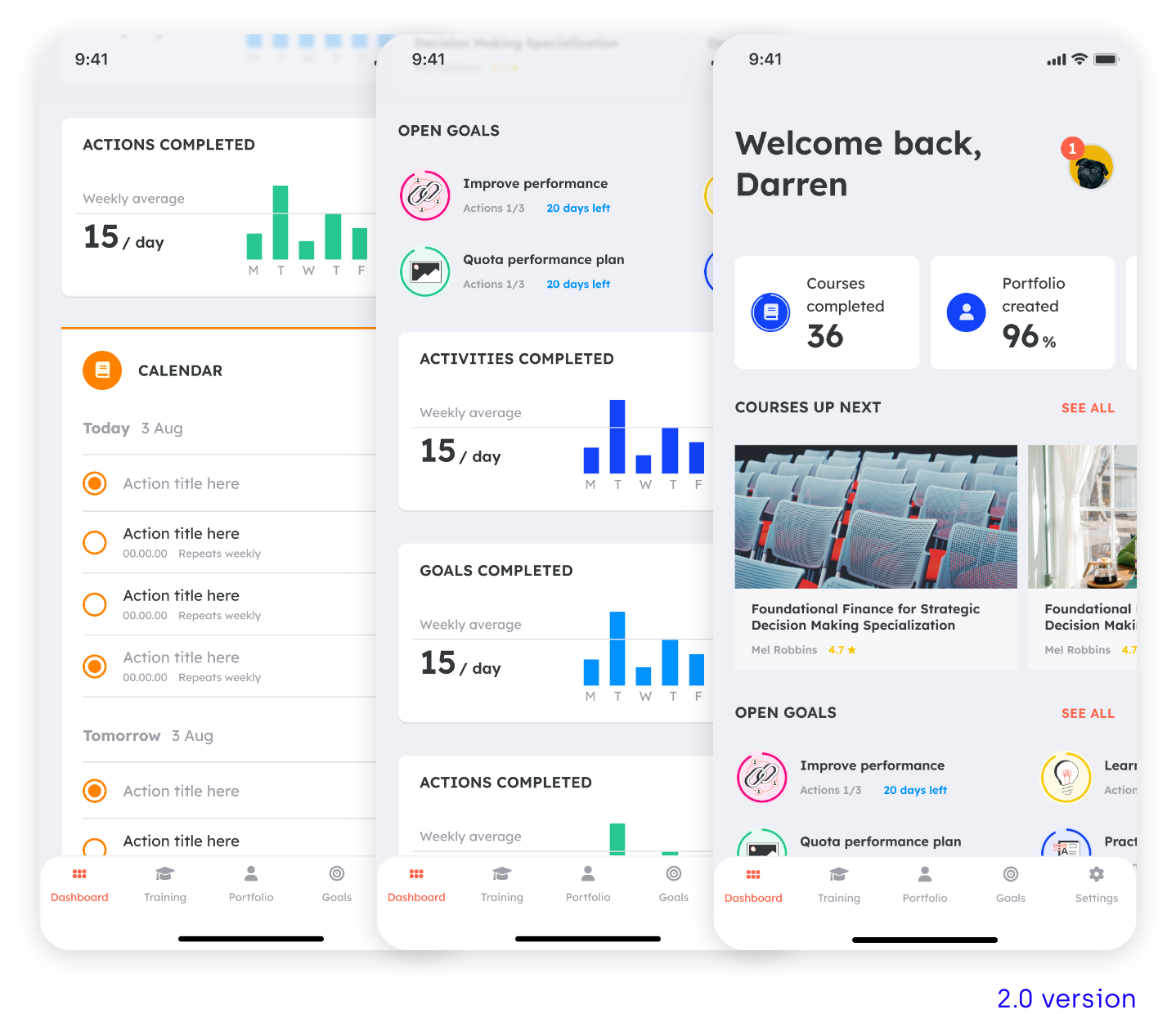
Dashboard isn’t engaging
SOLUTIONS
Create a bespoke brand for Goalster
Lighten the overall look and feel
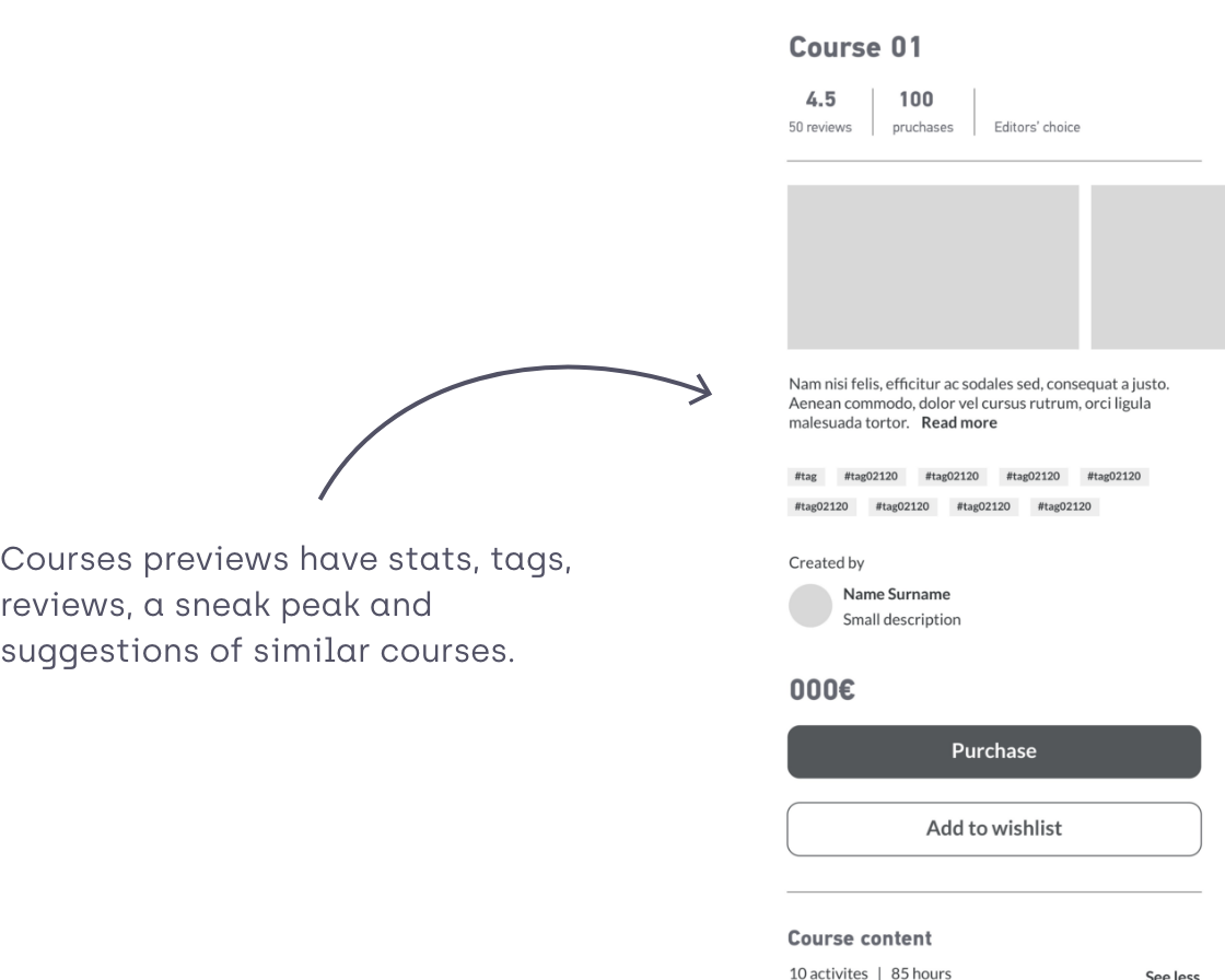
Redesign training hub section
Add more actions to the Dashboard
02|05
USER RESEARCH
SHADOWING SESSIONS
In order to evaluate the pain points of the current version, I’ve conducted a series of shadowing sessions with new and frequent users of the app. Some tasks were asked to the users like creating goals, actions and edit the portfolio.
PERSONAS
John
John has been a creative at the same company for many years and wants to improve his presentation skills in order to get a management position. He’s considered other coaching options before, but found them too expensive and too time-consuming.

Claire
Claire is a salesperson who wants to improve her sales numbers, but doesn’t know where to start. She set up a plan once, but after a few days, bogged down by routine, lost motivation to stick with it.
PAIN POINTS
After analysing the difference shadowing sessions these were the main pain points:

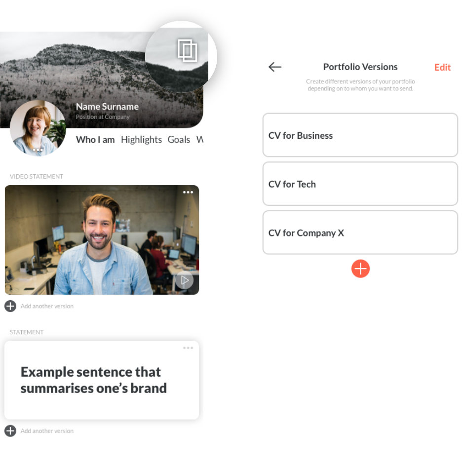
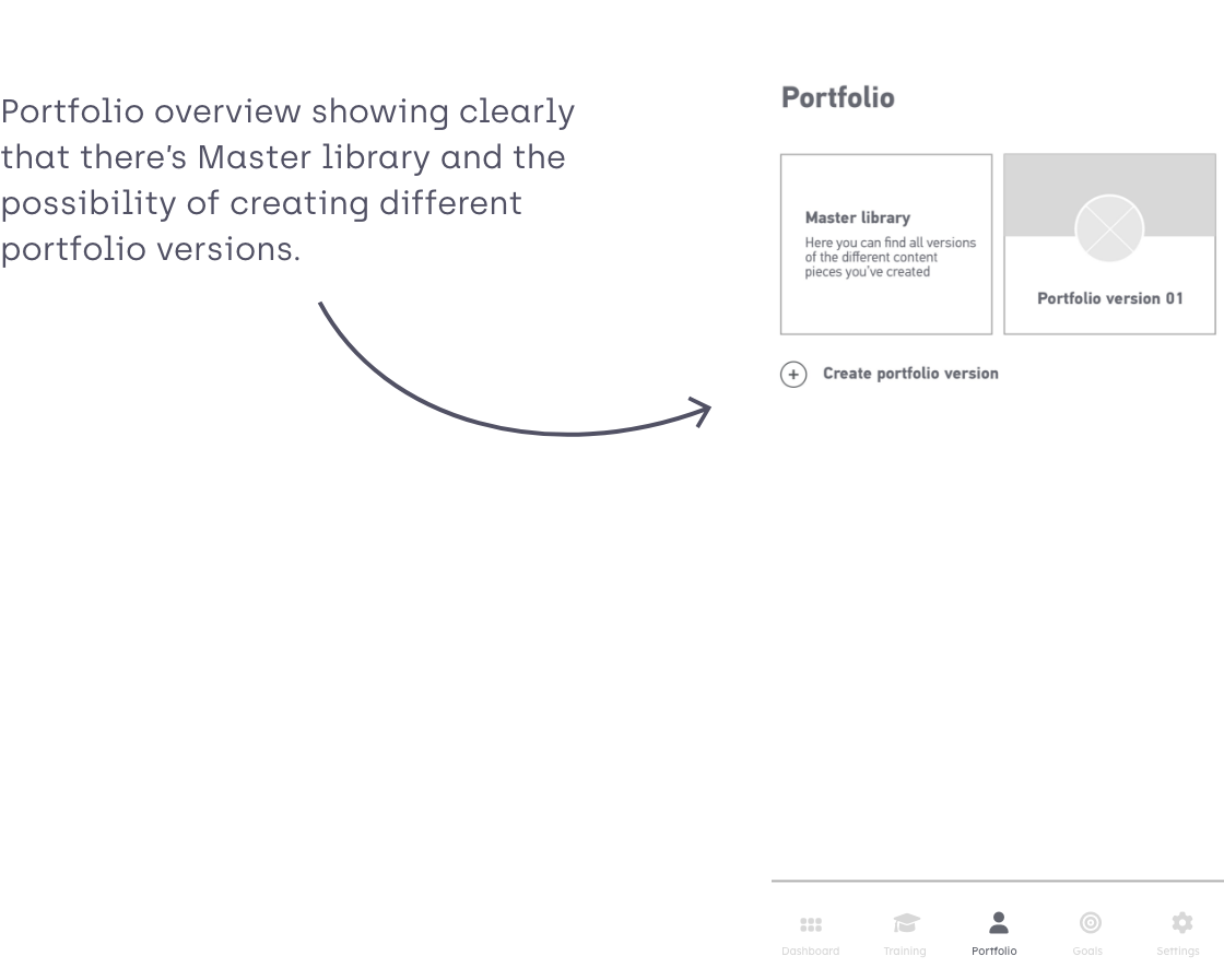
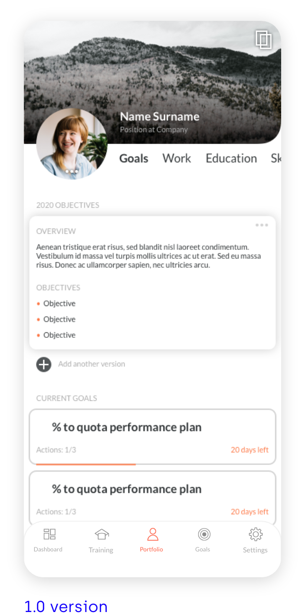
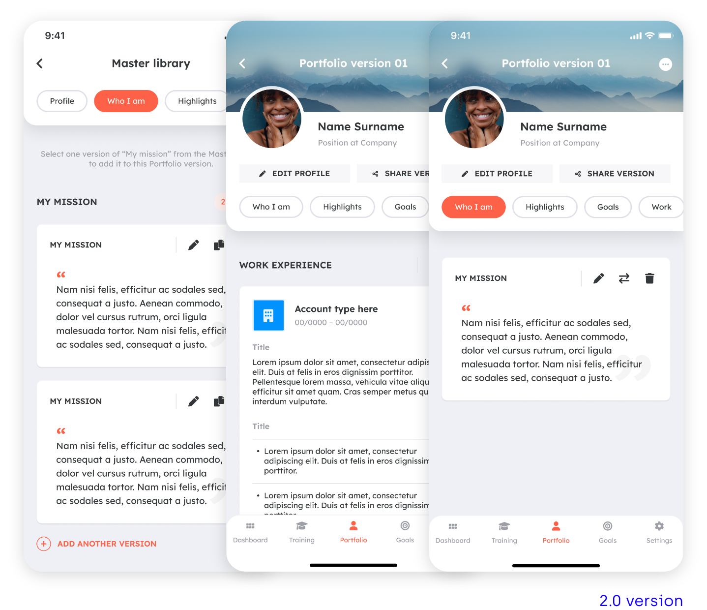
Portfolio functionality not fully-understood, users didn’t understand that they could create different versions of a portfolio depending on what company they would like to send to. Therefore the icon on the top right corner isn’t explicit enough.
There was some confusion on where the versions the different pieces of content were living.
The process of creating a goal was too long, there were two steps until getting to edit the actual goal.
Users didn’t understand the difference between the provided goal templates.
03|05
USER FLOW
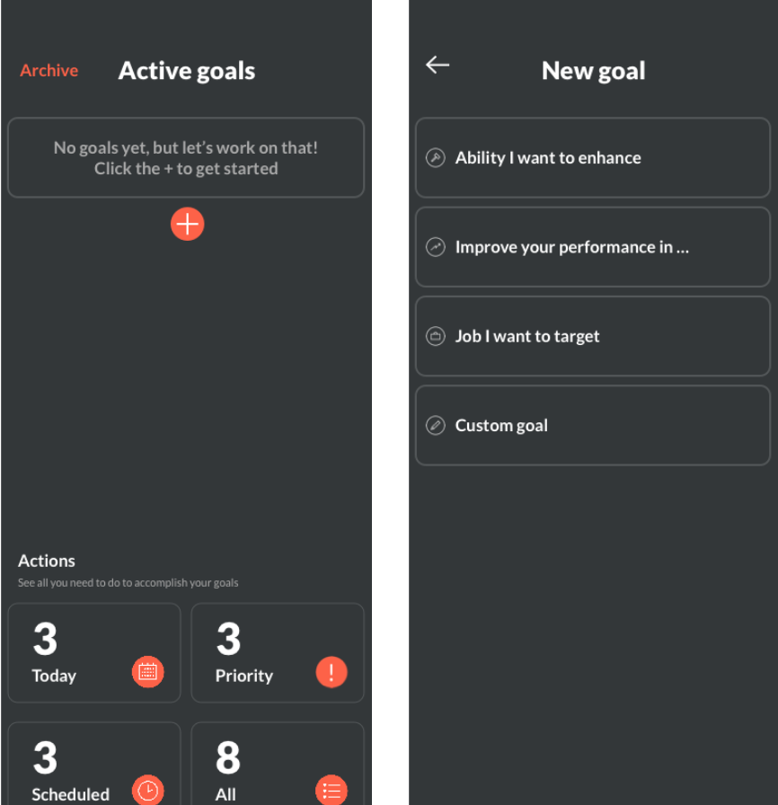
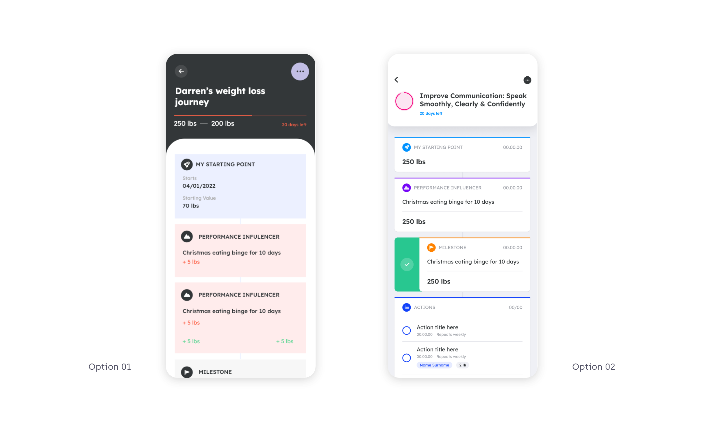
GOALS
Since the user din’t understand the existing goal templates, I provided different suggestions to the client and see what route they would like to take depending on their budget/time:
– We could create a longer list with specific templates (eg get a promotion, find a new job). They would all have the same setup and features, and would work as suggestions for the user to know what goals they could create.
– Alternatively, we could have the specific templates (eg get a promotion, find a new job) but with a custom made setup to each individual goal template. These templates would have pre-populated milestones and actions guiding the user achieving their goals. These would require a new workstream and a potential collaboration with specialist in different areas that could translate their expertise and processes into a Goalster goal.
– Another solution is to scrap this step altogether and the user just jumps into populating their new goal
The client picked the latter.

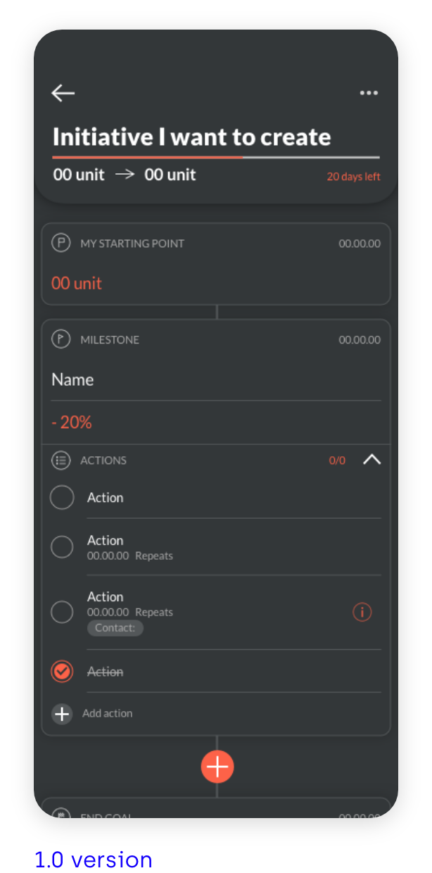
Previous create goal user flow
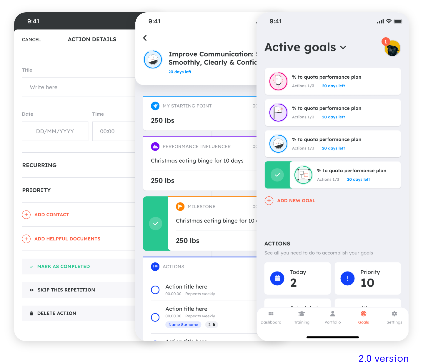
New create goal user flow

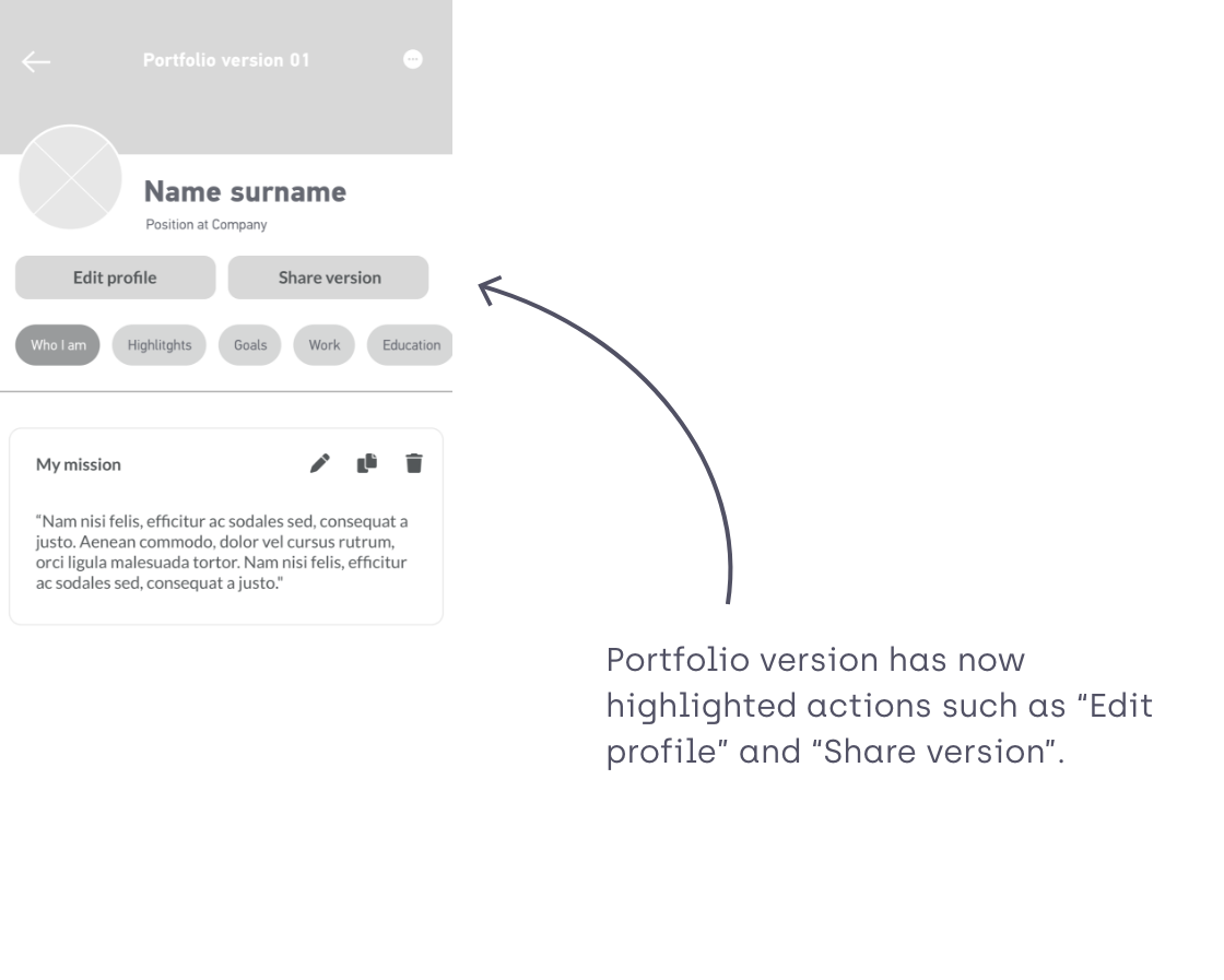
PORTFOLIO
I developed a new user flow for the portfolio section. The user lands straight way in the Portfolio overview so they can see that there’s a Master library were they can find all the versions of the different content pieces, and then there’s the possibility to create different versions of the portfolio which are going to be populated with those content pieces.

04|05
WIREFRAMES
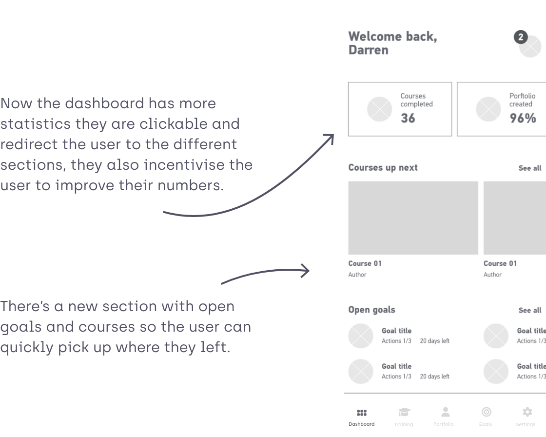
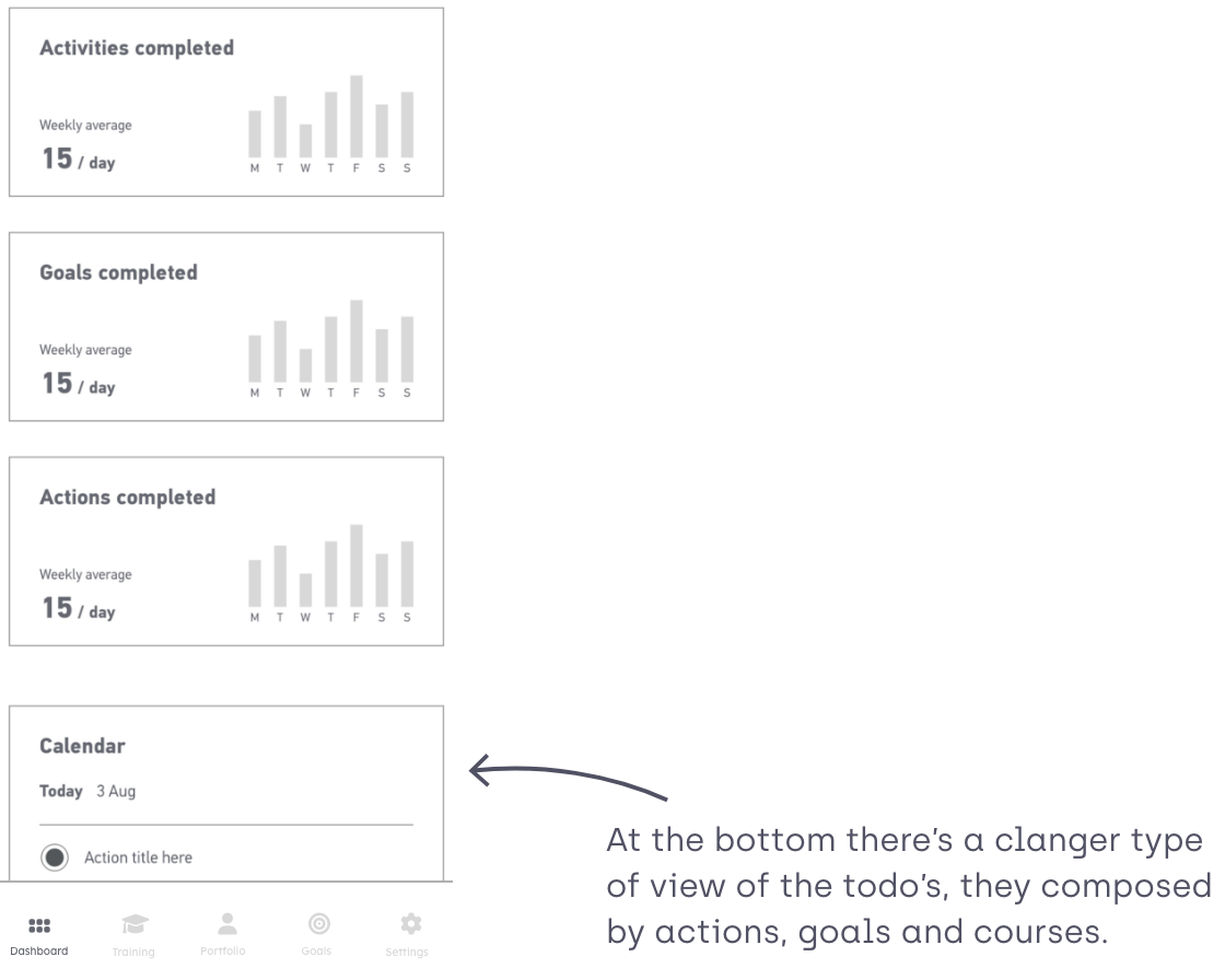
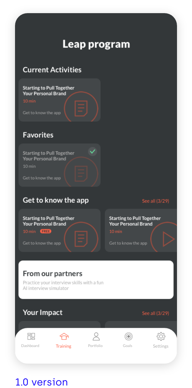
DASHBOARD
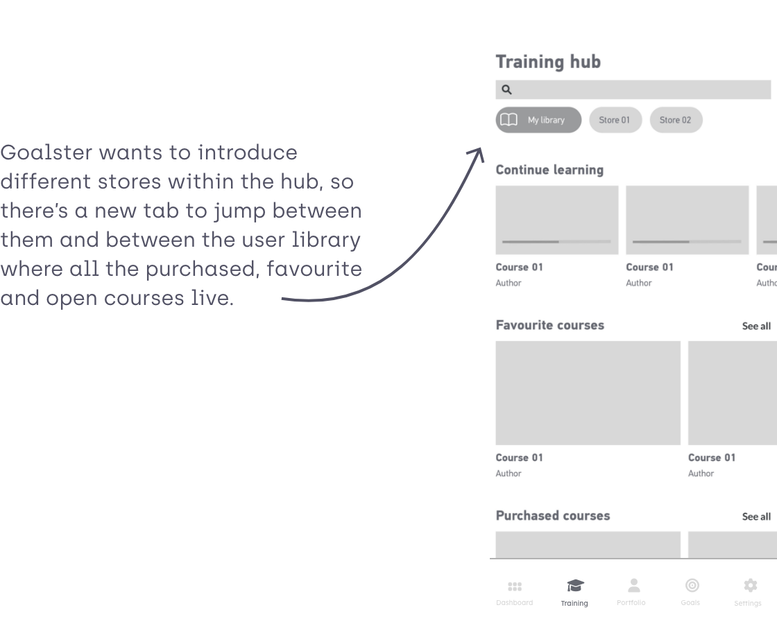
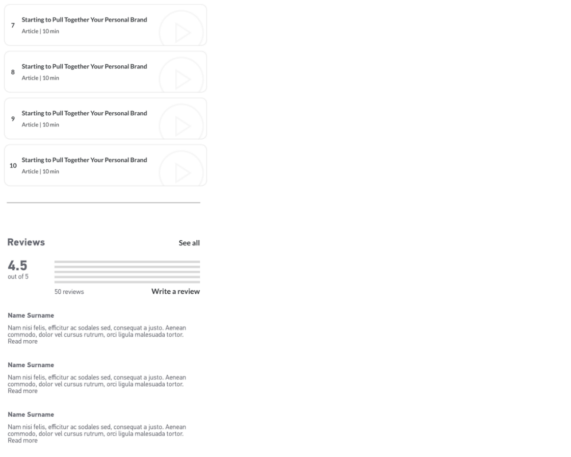
TRAINING HUB
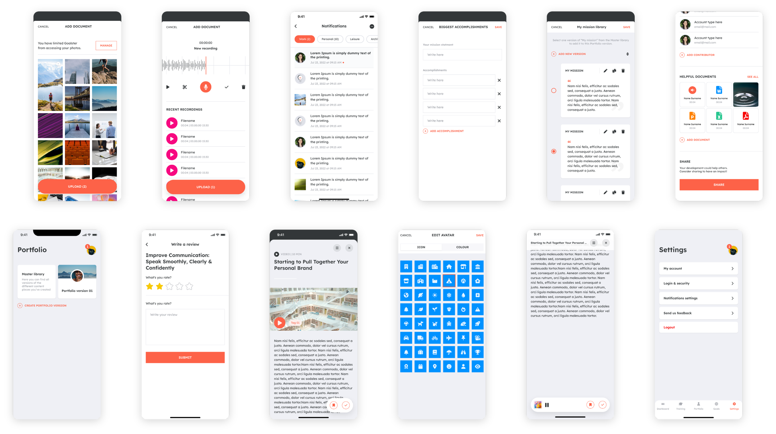
PORTFOLIO
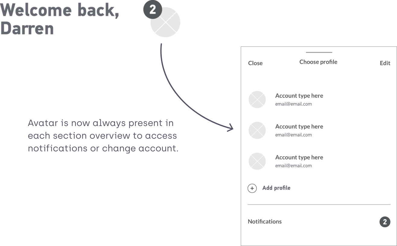
AVATAR
05|05
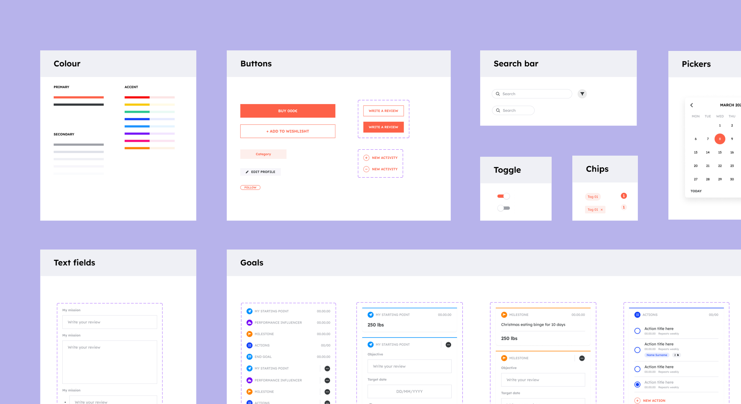
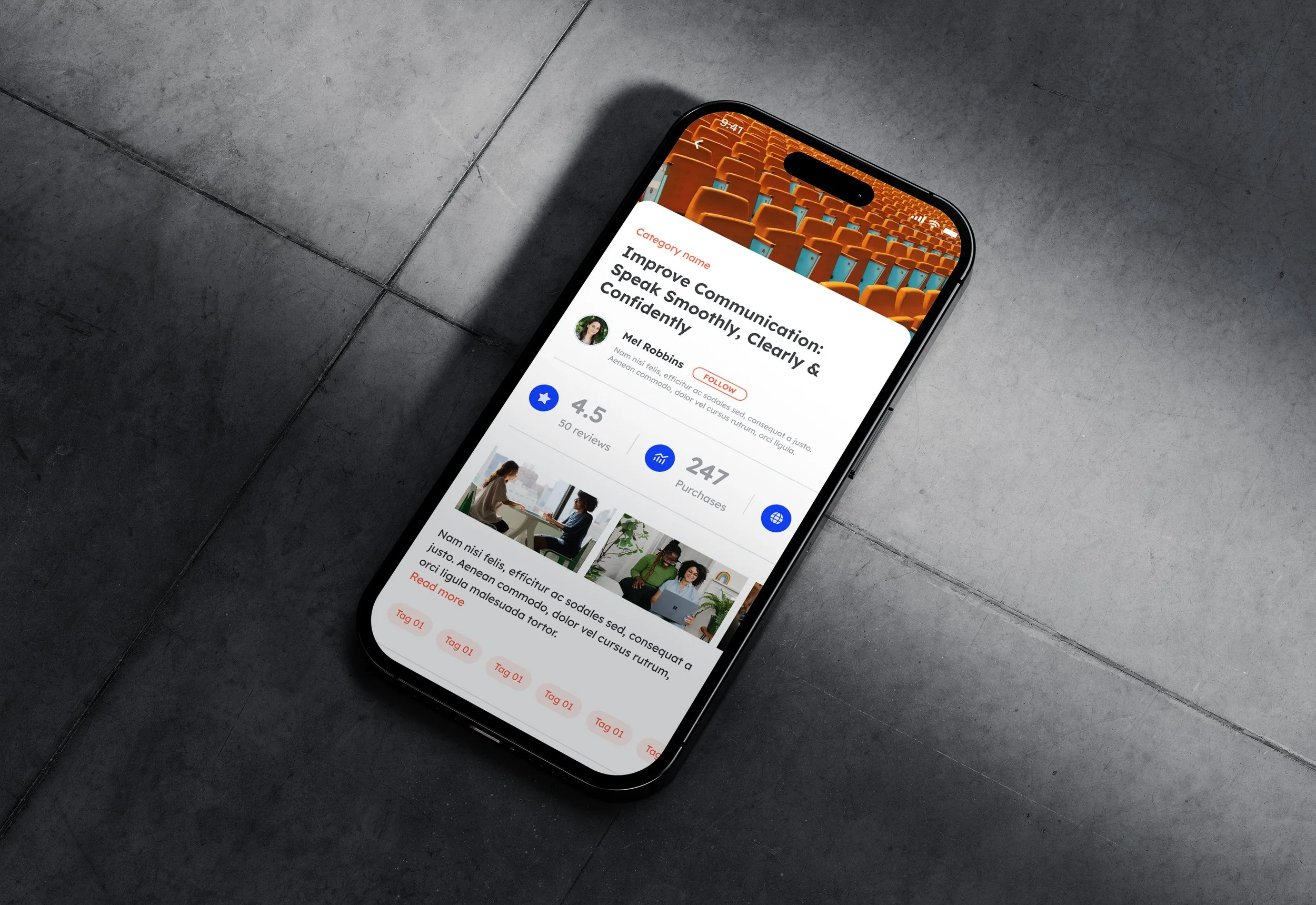
VISUAL DESIGN
MOODS
Before starting the redesign of Goalster look, I’ve made a collection of moods that would fit the brand.
VISUAL EXPLORATION
I then worked on different looks. First option was going on the right direction but the colours were too muted for an action driven app. The second look had a fresh, light but vibrant look, so we went with this one.
LOCK AND SCALE
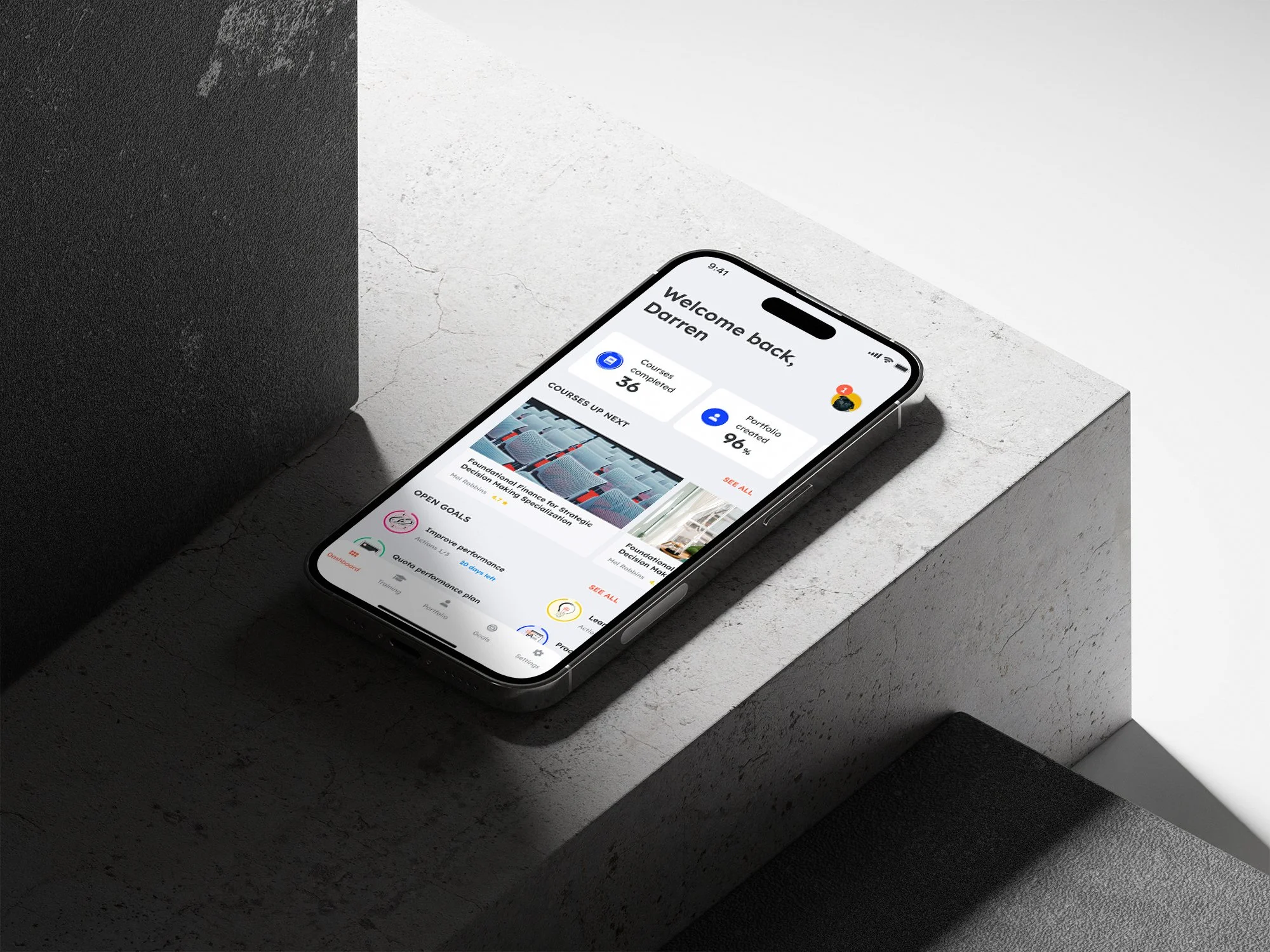
Dashboard
Training hub
Portfolio
Goals