GOALSTER MOBILE APP
UX/UI | Branding
With a three-week turnaround, I designed a mobile app to translate a leadership expert’s experience in career development into a personalizable digital parter that helps users achieve their career and life goals. Goalster, the executive coach in your pocket, is built from simple UI elements that fasten user inputs into a total structure for planning, achievement and personal growth.
This use case is divided in 8 parts: analysing the problem, design strategy, personas, task analysis, information architecture, wireframe, styleguide and final look.
My role
Design strategy
Research
Competitor analysis
User flow
Information architecture
Wireframes
Prototyping
Visual design
Tools
Sketch
Adobe Illustrator

01|08
ANALYSING THE PROBLEM
People often want to upgrade their career, skill set or expand their network, but many find it difficult to start or stick to their plans for personal and career growth. Simple and effective solutions are suggested for the user’s pain points.
PROBLEMS
1. Lack of time
2. Difficulty staying disciplined and motivated
3. High cost for most coaching services
SOLUTIONS
1. Courses are broken into smaller activities that can be easily picked up with minimal time commitment
2. Users benefit from the increased motivation that comes with engaging notifications, customizable reminders, and game-like reward elements
3. An affordable subscription grants easy access to the founder’s expertise in the form of a hands-on digital coach
02|08
DESIGN STRATEGY

BUSINESS GOALS
Providing an incredible coaching program
Motivating people to keep using the app

BRANDING AND MARKETING GOALS
Making it engaging
Selling subscription packages for further learning material and exclusive features

GENERAL TASKS
Enrol the Goalster coaching program
Create a goal
Complete personal portfolio
Share progress
TECHNOLOGY
Mobile device (iOS/Android)

SUCCESS FACTORS
Personal growth
Build new skill-sets
Create an impressive portfolio
Complete personal/work goals
03|08
PERSONAS
JOHN
John has been a creative at the same company for many years and wants to improve his presentation skills in order to get a management position. He’s considered other coaching options before, but found them too expensive and too time-consuming.

CLAIRE
Claire is a salesperson who wants to improve her sales numbers, but doesn’t know where to start. She set up a plan once, but after a few days, bogged down by routine, lost motivation to stick with it.
04|08
TASK ANALYSIS
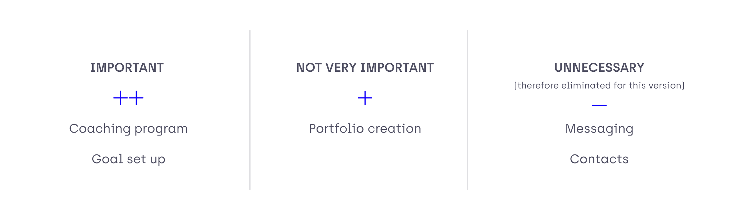
The briefing was quite specific on the feature group that should included:
a coach program (training course with different lessons),
a portfolio (to work like a CV; with the possibility to receive feedback from colleagues),
a network (with a messaging feature, contact book, and contact suggestions), and
a goal setup tool (to create goals with milestones).
We ranked these features by importance and eliminated those diluting from the main goals of the app in order to support new users with a clear perspective on how the app fits into their aims and routine.

05|08
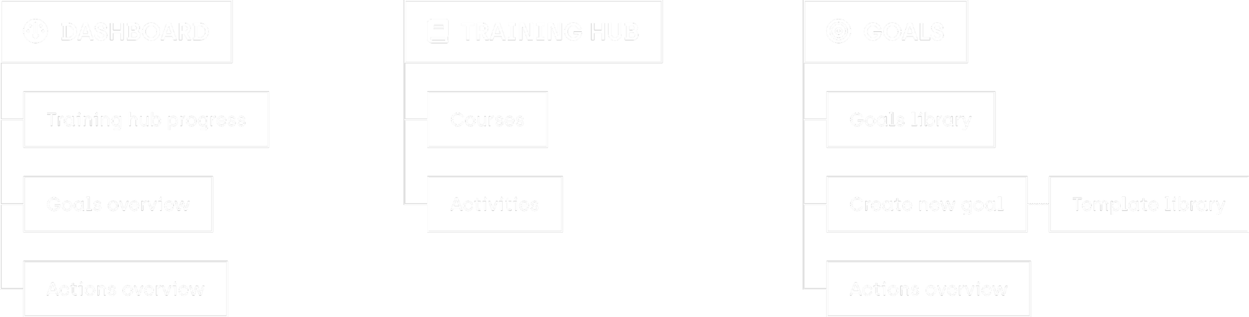
INFORMATION
ARCHITECTURE

06|08
WIREFRAMES
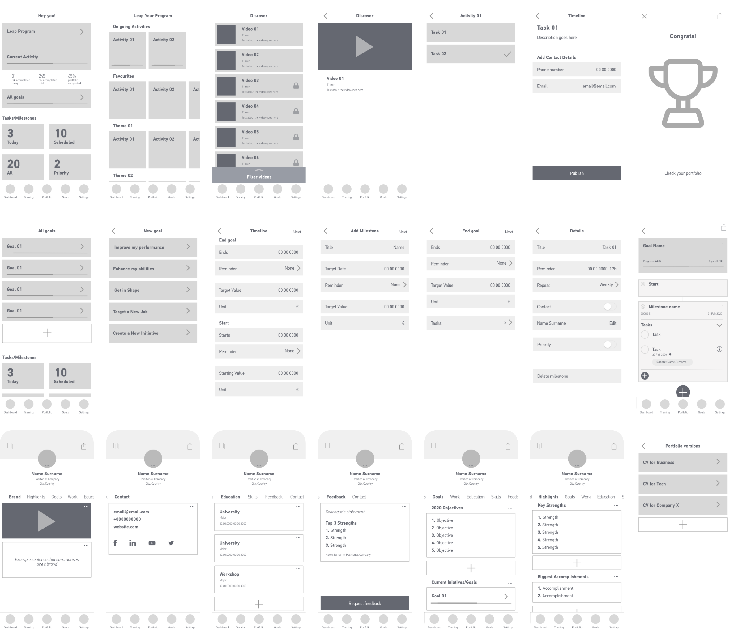
Based on the information architecture, I developed full wireframes for the app in order to test the flow and identify the necessary interactive elements.
Let’s have a closer look on how some of the wireframes.
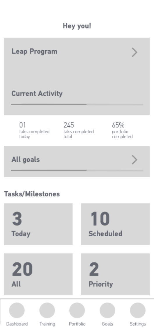
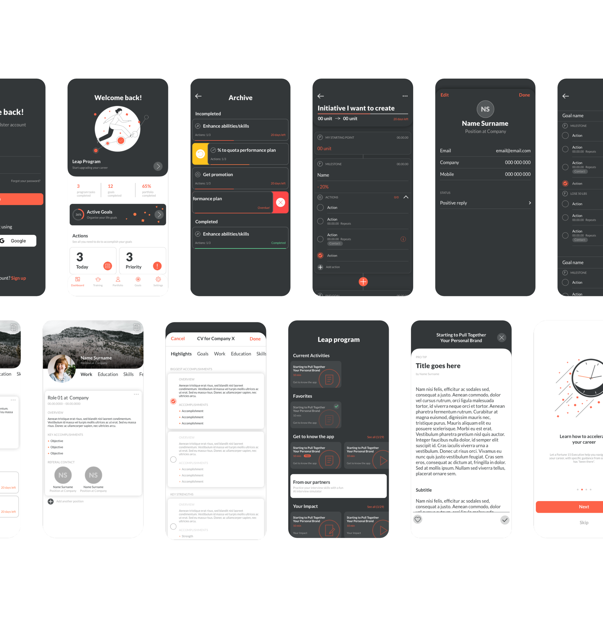
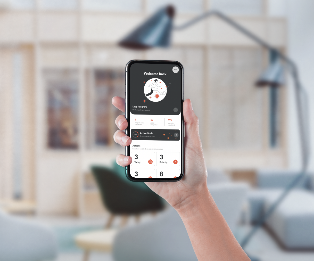
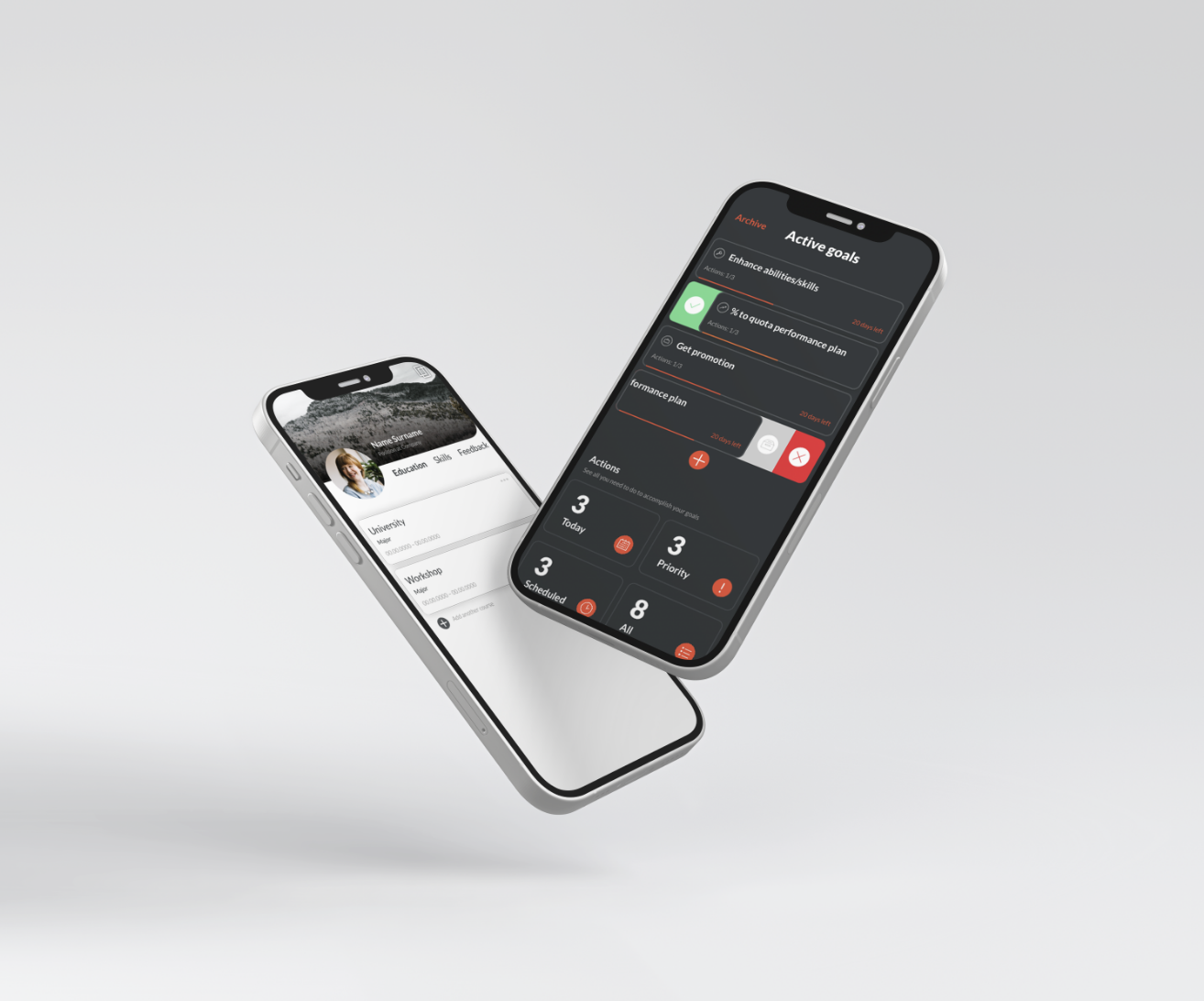
DASHBOARD
This is the first screen the user is going to see every time they open the app.
Having in mind the pain points detected at the beginning of this process (1. lack of time, 2. difficulty staying disciplined and motived and 3. high cost for most coaching services), this screen should be engaging, action-orientated and motivational to solve problem 2 and provide access to the affordable and gradual coaching program, the Leap program, to solve problem 1 and 3.
In order to accomplish the above, the dashboard was structured as an overview of what are the user’s next steps with thumbnails that link to the different sections and statistics to motivate them to keep the good work.
The Leap program is the big selling point of Goalster, it’s one the factors that disguises it from the competitors, so it’s important to highlight it. Therefore at the very top sits a big thumbnail with a progress bar and the name of the activity from the Leap program the user is currently.
Below that there’re a few statistics like number of tasks completed that day and how far long they are in the process of building their portfolio. These intend to push the user to want improve those numbers everyday.
Attached is a clickable container to the goals overview, here there’s also a progress bar to increase user engagement.
At the bottom, we have the tasks and milestones created by the user within their goals, organised by four categories. This way the user can easily access the tasks they have to take action on without having to go to each individual goal, avoiding important tasks getting missed.
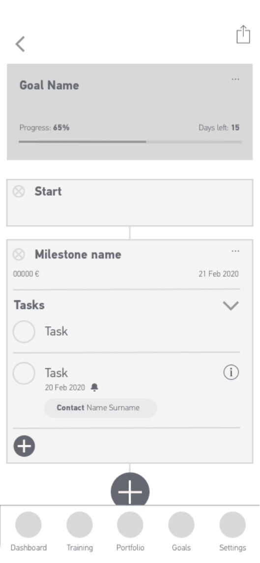
GOAL BUILDER
Here is where the user is going to structure the journey to accomplish a certain goal. The process of building one should be easy and intuitive.
The way I saw this section was as a timeline built with modular blocks. Therefore this screen is composed by containers with information that are connected through a continuous line. The blocks can have different purposes and are customisable. The user can add or remove containers through this line. Once they build it, they can follow it one step at the time until they finally reach their goal.
In this way, the user has an overview of the process they will take part and it will feel more manageable to see it broken down in multiple small steps.
First things first, when thinking about a goal the first steps are setting the start and end dates and defining how the goal looks like, either with numbers or text, so the default building blocks are the start and end goal. The user can select and customise these.
In between them there’s a plus sign to add more blocks. One type of block is milestone, which indicates there will be a checkpoint or intermediate goal with a fixed date. Another is a group of tasks, these work as a to-do list, they come with the possibility of attributing a contact, reminders, priority levels and repetition to a task.
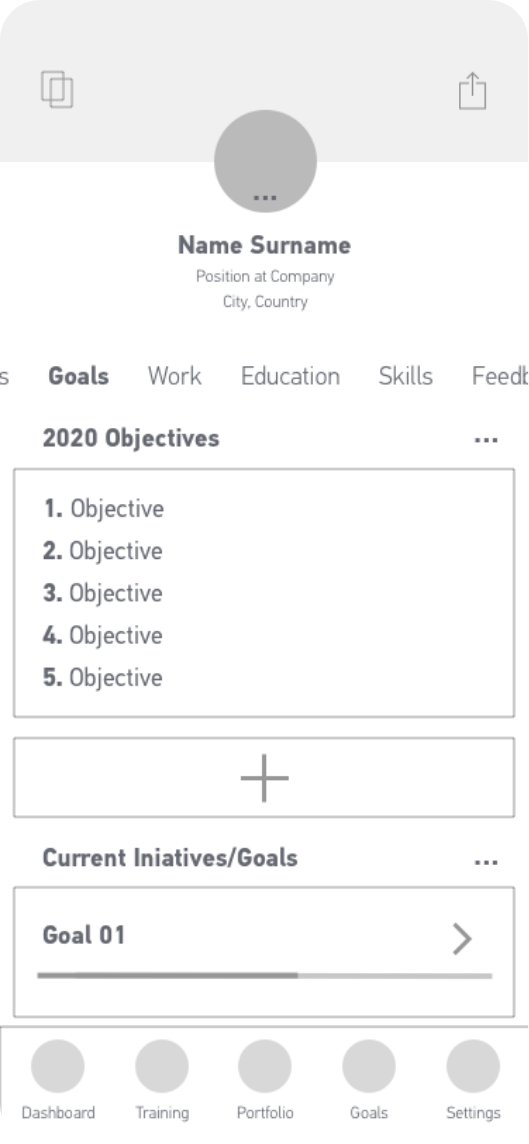
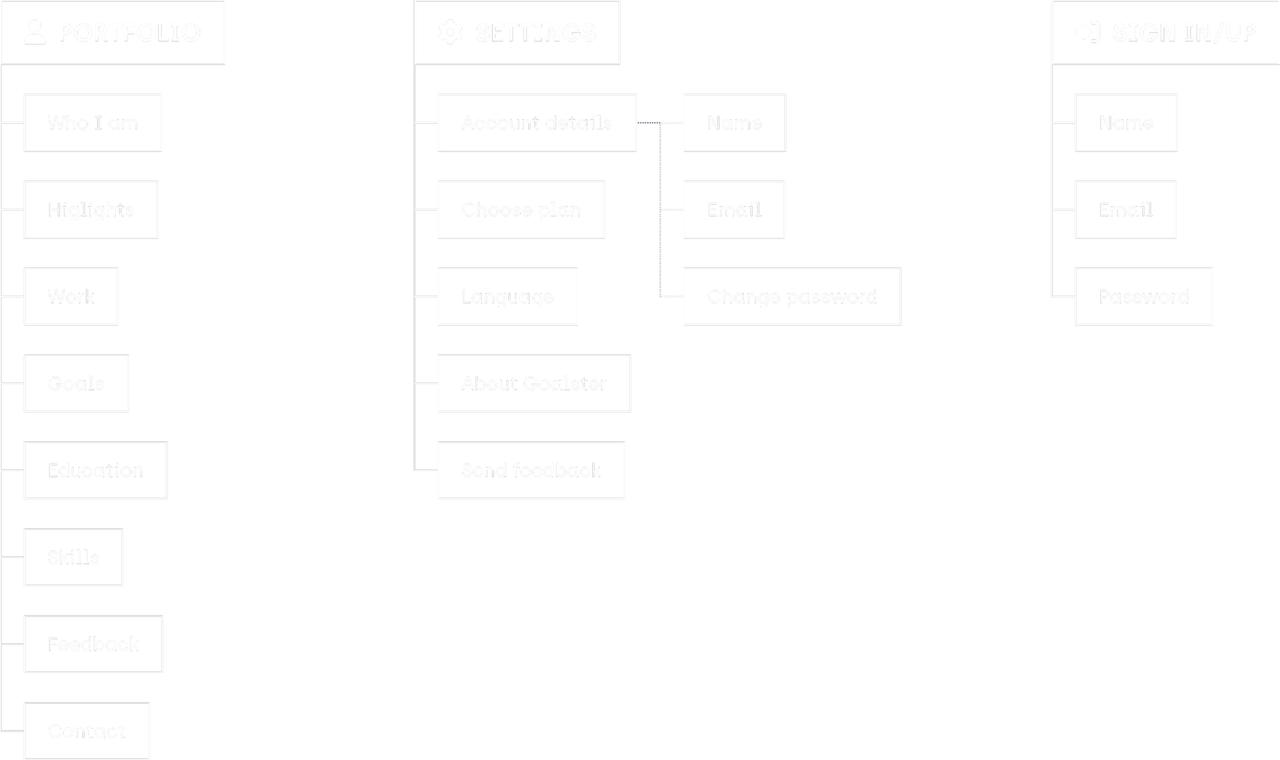
PORTFOLIO
Portfolio works as a CV, a place where people showcase their professional path and also their goals accomplished while using the Goalster app. It should have a distinctive, professional and appealing look, and it should feel intuitive to use and easy to share.
Most CVs follow the same structure, so after analysing multiple examples I came to a selection of sections, like education skills and contacts, and an extra section dedicated to the user’s accomplishments on the app. Here the user not only shows their achieved goals but also how they did it, giving a peak to their way of thinking and processes taken.
When looking for a new job, the candidate has to act like a chameleon: depending on the company they are applying to, they highlight the relevant parts of their career; thus the CV needing to be chameleonic as well. To achieve that the user has the possibility to create different versions of their portfolio, name them, customise them to each purpose and then share them, making it an already painful process easier to manage.
07|08
STYLEGUIDE
PRIMARY COLOURS
ACCENT COLOURS
FONTS

I’ve chosen grey and orange as Goalster main brand colours since they are decisive and strong motivational colours. For backgrounds and containers I use shades of the Goalster grey and for accent elements like alerts or colour coded info I created a traffic light system.
08|08
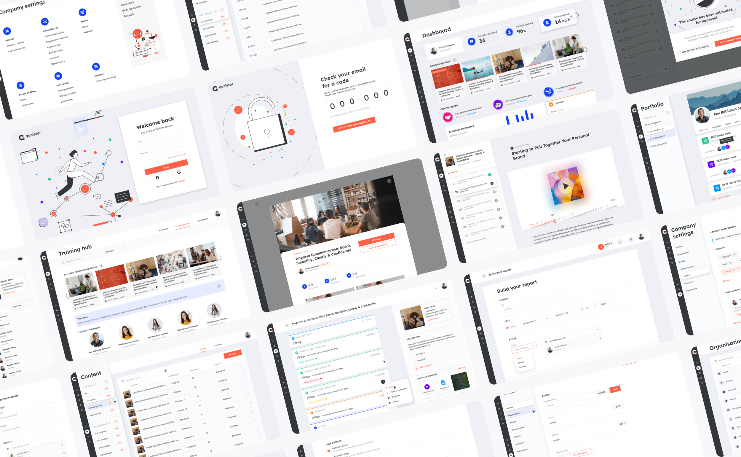
FINAL LOOK