APPOINTMENT BOOKING WIDGET
UX/UI
Medbelle works with a large network of consultants whose availability varies significantly. Some provide real-time appointment slots, while others only share broader availability windows. The challenge was to design a single booking experience flexible enough to handle both scenarios, while remaining clear, trustworthy, and easy to embed across different surfaces.
This use case is divided in 5 parts: analysing the problem, goals, competitor analysis, design strategy and validation.
Medbelle
Product designer
ROLE
COMPANY
OUTCOME
SCOPE
Enabled direct self-service booking with consultants, reducing reliance on phone calls and improving access to availability
UX · UI · Patient-facing · Booking & conversion

01|05
THE PROBLEM
Patients had no simple way to book a consultation directly with a consultant, often requiring phone call despite high booking intent.
02|05
GOALS
Enable patients to book consultations without calling
Clearly communicate consultant availability at a glance
Support different availability models (time slots vs time windows)
Create a reusable, embeddable widget for multiple contexts
Reduce friction at the point of high booking intent

03|05
DISCOVERY & COMPETITOR ANALYSIS
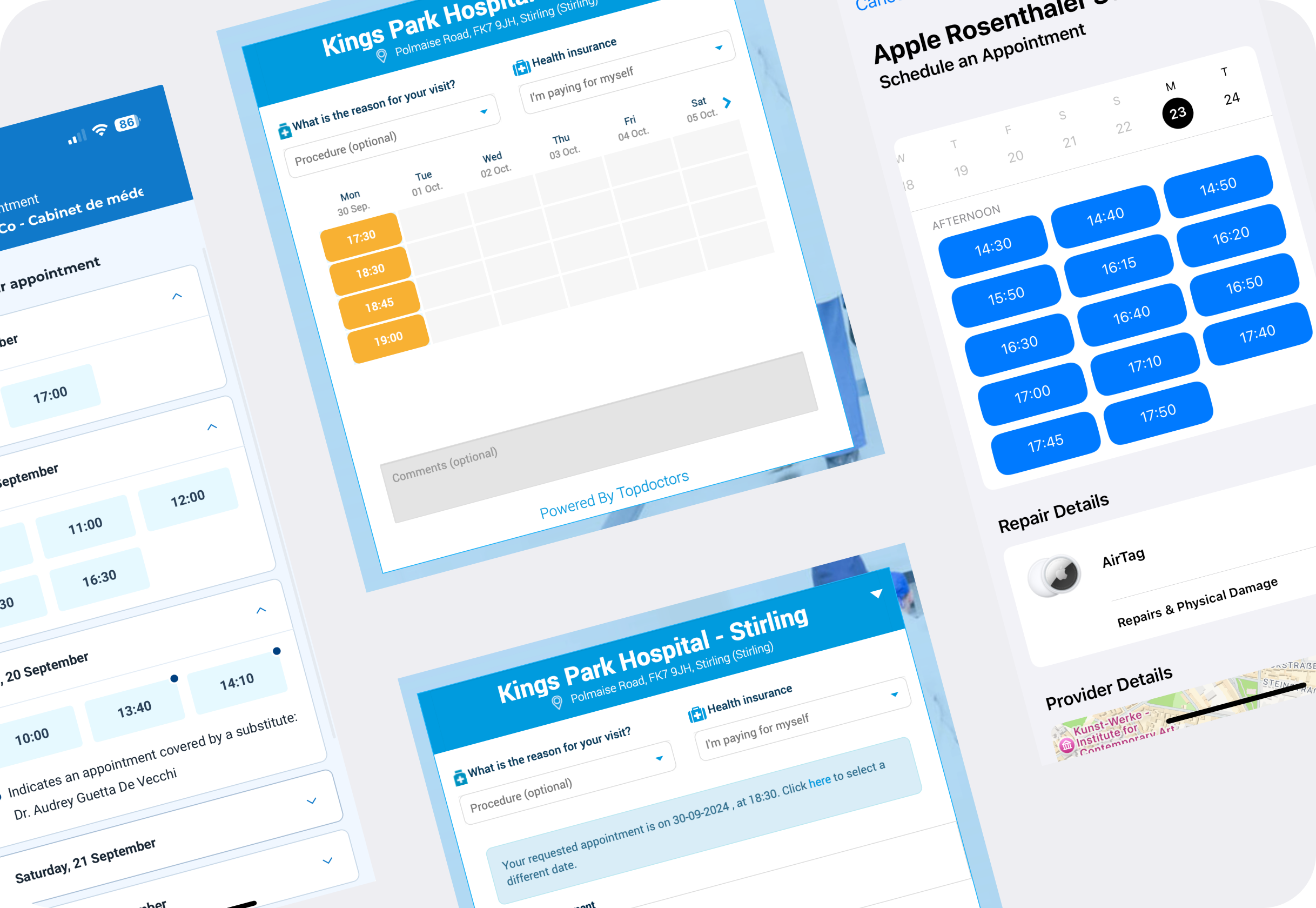
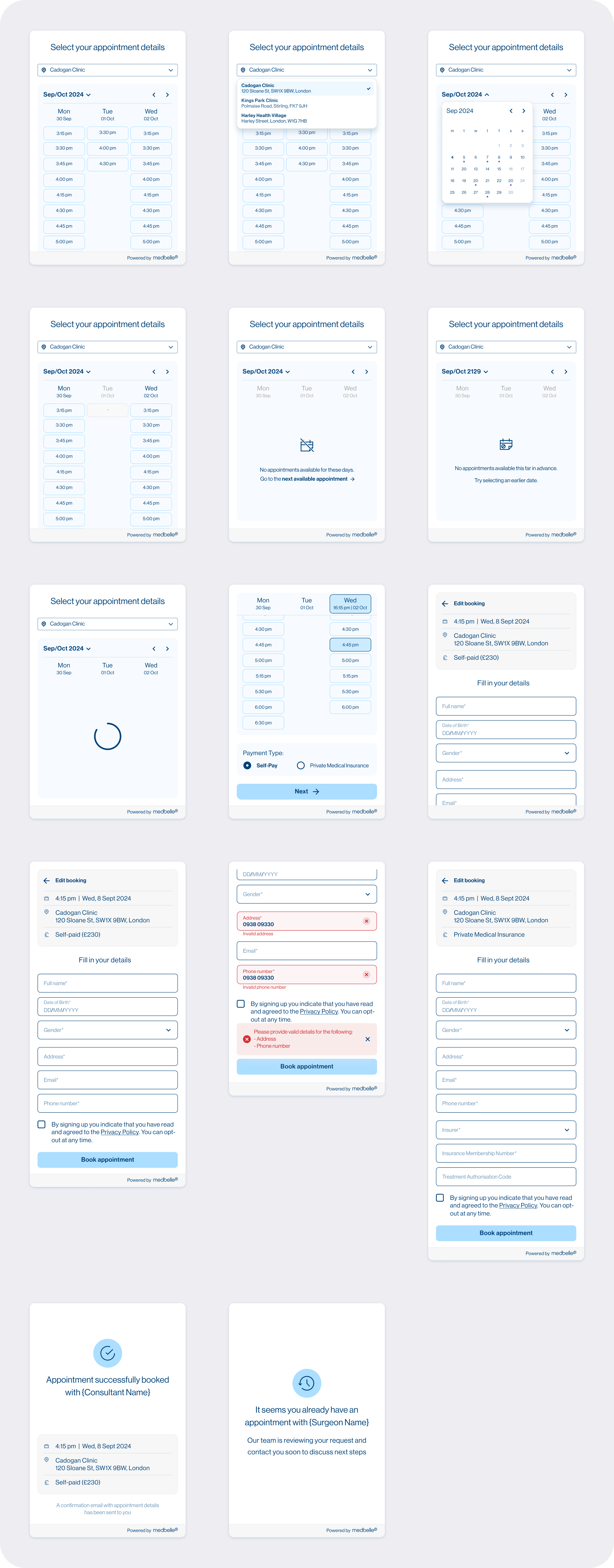
As part of the discovery phase, I reviewed existing appointment booking widgets across healthcare and service-based platforms to understand common patterns around availability display, pricing, and booking flows.
Key observations
Self-pay consultations often surface pricing early to set expectations
Availability is commonly presented either as:
a list of individual time slots, or
broader time windows when real-time data is not available
Many widgets prioritise speed over context, making it easy to select a time but harder to understand overall availability
This analysis helped identify which patterns were transferable and which required adaptation to Medbelle’s operational constraints.
04|05
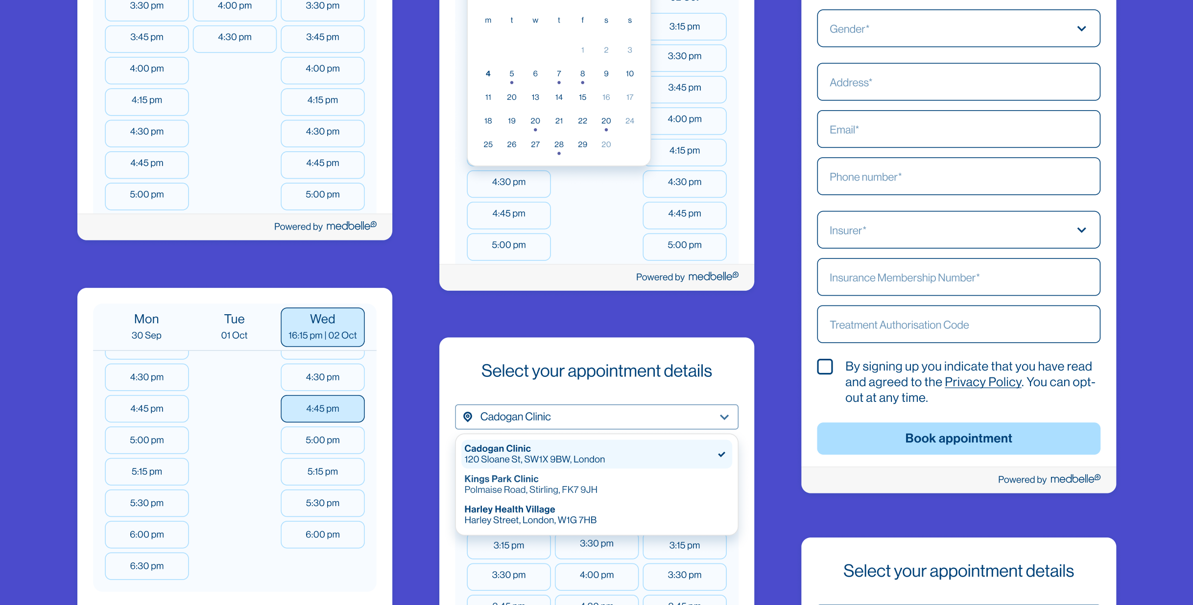
DESIGN STRATEGY
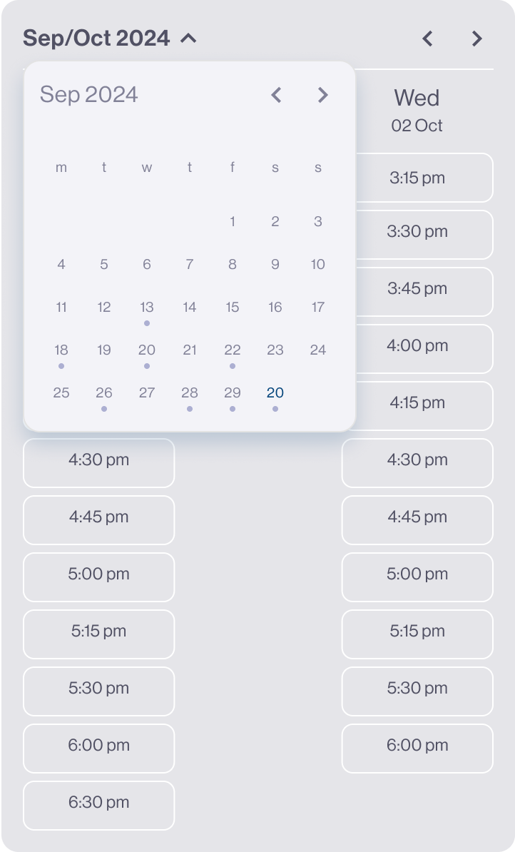
1. AVAILABILITY-FIRST EXPERIENCE
Surfaced available dates and times immediately on load
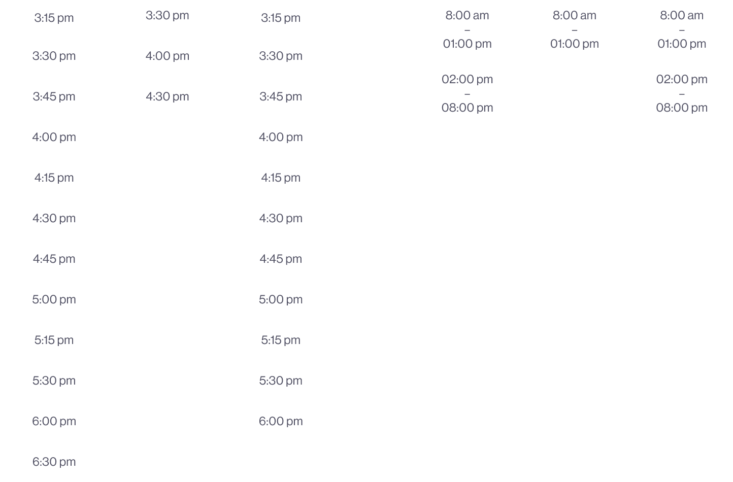
Displayed exact time slots where available
Used broader availability windows (e.g. 3pm–7pm) where granular data was not accessible
2. AVAILABILITY-LED LAYOUT DECISIONS
Organised days and time slots within the same column to prioritise an overview of which days have availability
Optimised for scenarios with limited or variable availability, where users typically choose between few options rather than many
Avoided slot-heavy layouts that assume dense, real-time calendars
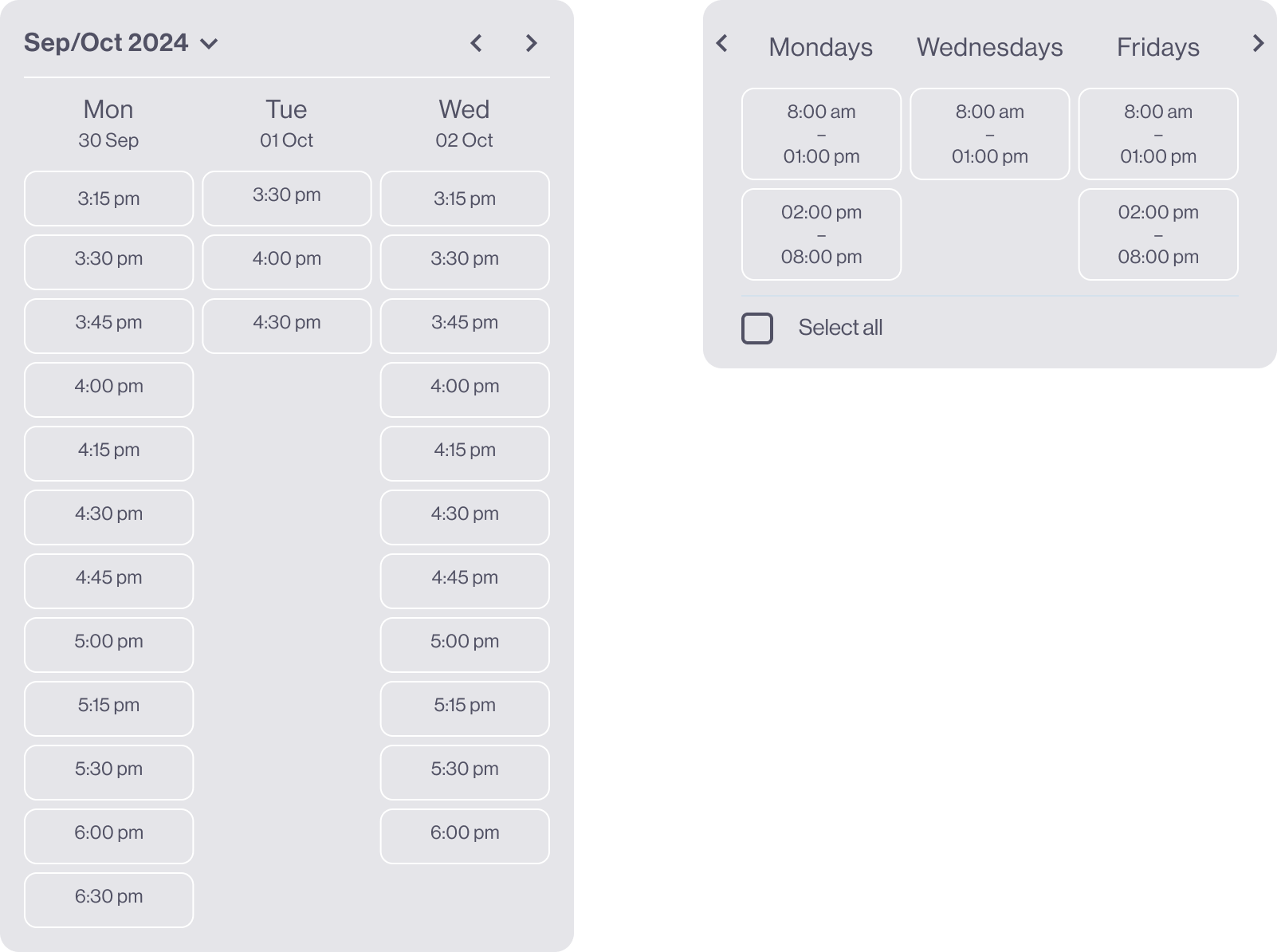
3. FLEXIBLE DATE NAVIGATION
Enabled users to jump ahead by month
Provided a calendar overview for future availability
Allowed users to skip unavailable periods and jump directly to the next available date
4. CLEAR BOOKING PROGRESSION
Selecting a time automatically scrolled users to the next step
Displayed a persistent summary of the selected appointment (date & time)
Reduced uncertainty by confirming choices at every step
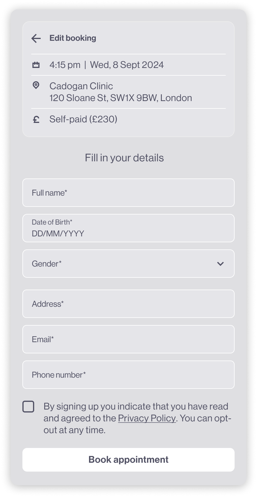
5. SIMPLE, FOCUSED CHECKOUT FLOW
Allowed users to select payment route (self-pay or private insurance)
Collected personal and insurance details in a single, streamlined form
Confirmed booking with clear success feedback and appointment details
The final widget provides a clear, step-by-step booking experience that adapts to different consultant availability models. By prioritising visibility of availability, reducing unnecessary steps, and confirming user choices throughout the flow, the design enables patients to book consultations confidently without relying on phone-based coordination.
05|05
ITERATION & VALIDATION
FUNNEL OVERVIEW
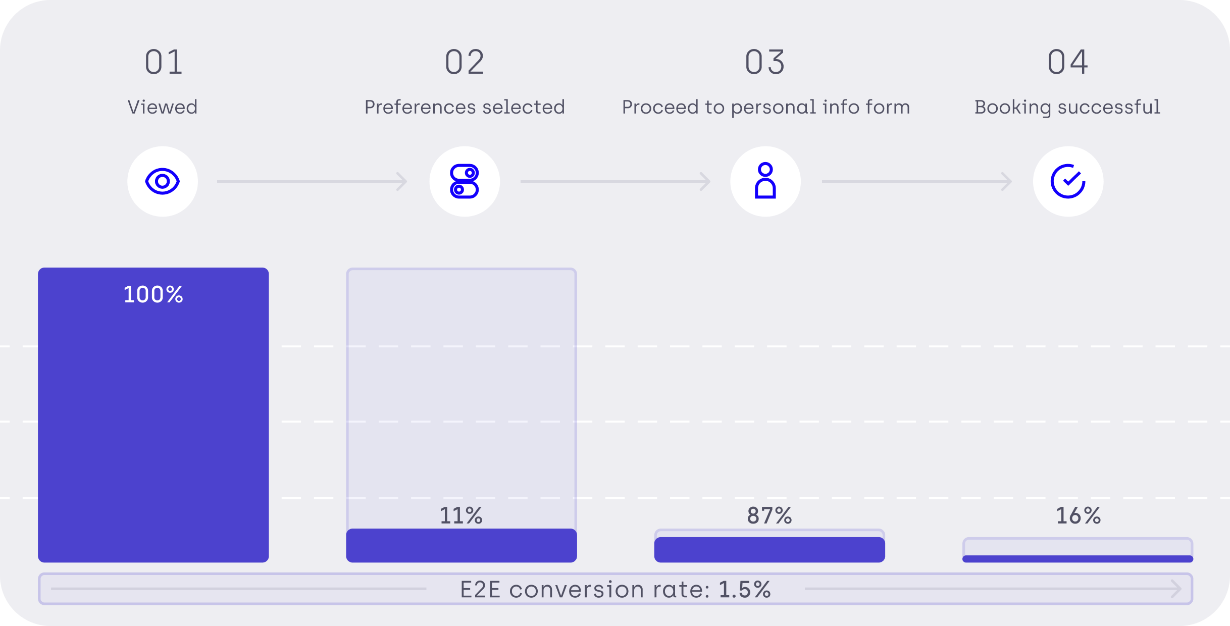
The booking widget followed a clear four-step funnel:
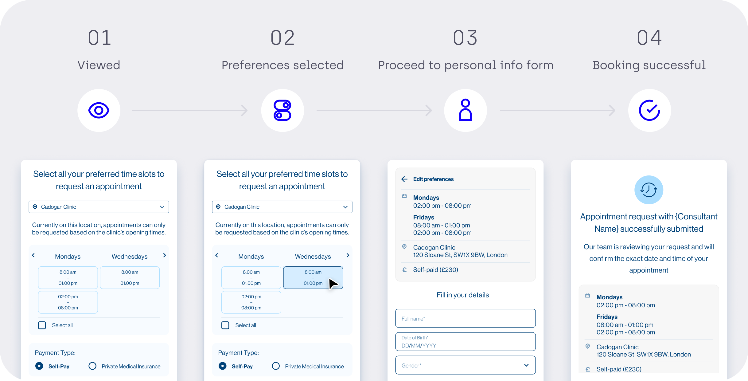
Initial data showed that end-to-end conversion was very low, with the biggest drop occurring between proceeding to the personal information form and successful booking.
KEY OBSERVATIONS & HYPOTHESE
Based on analytics, shadowing sessions, and qualitative observation, several issues emerged:
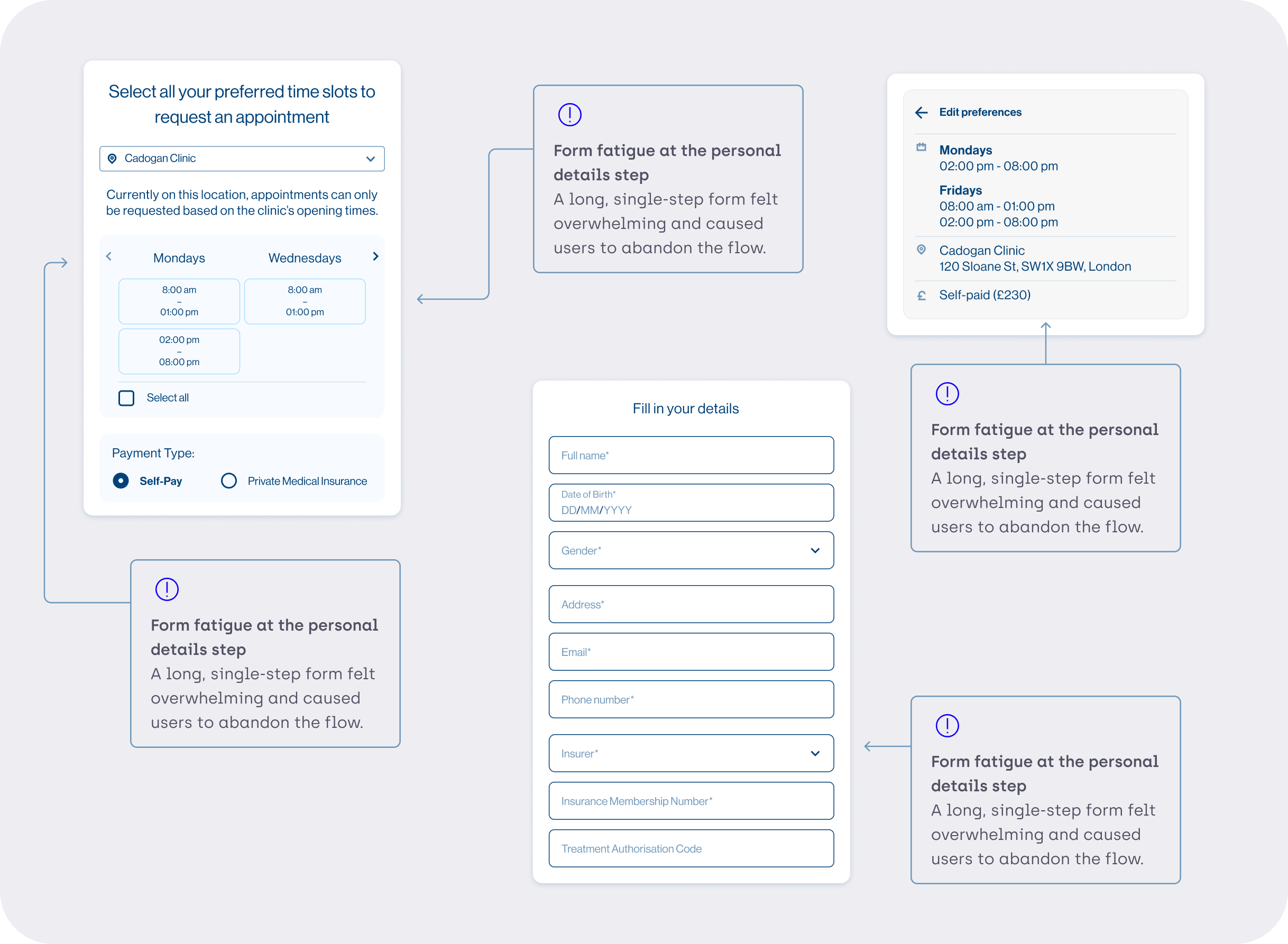
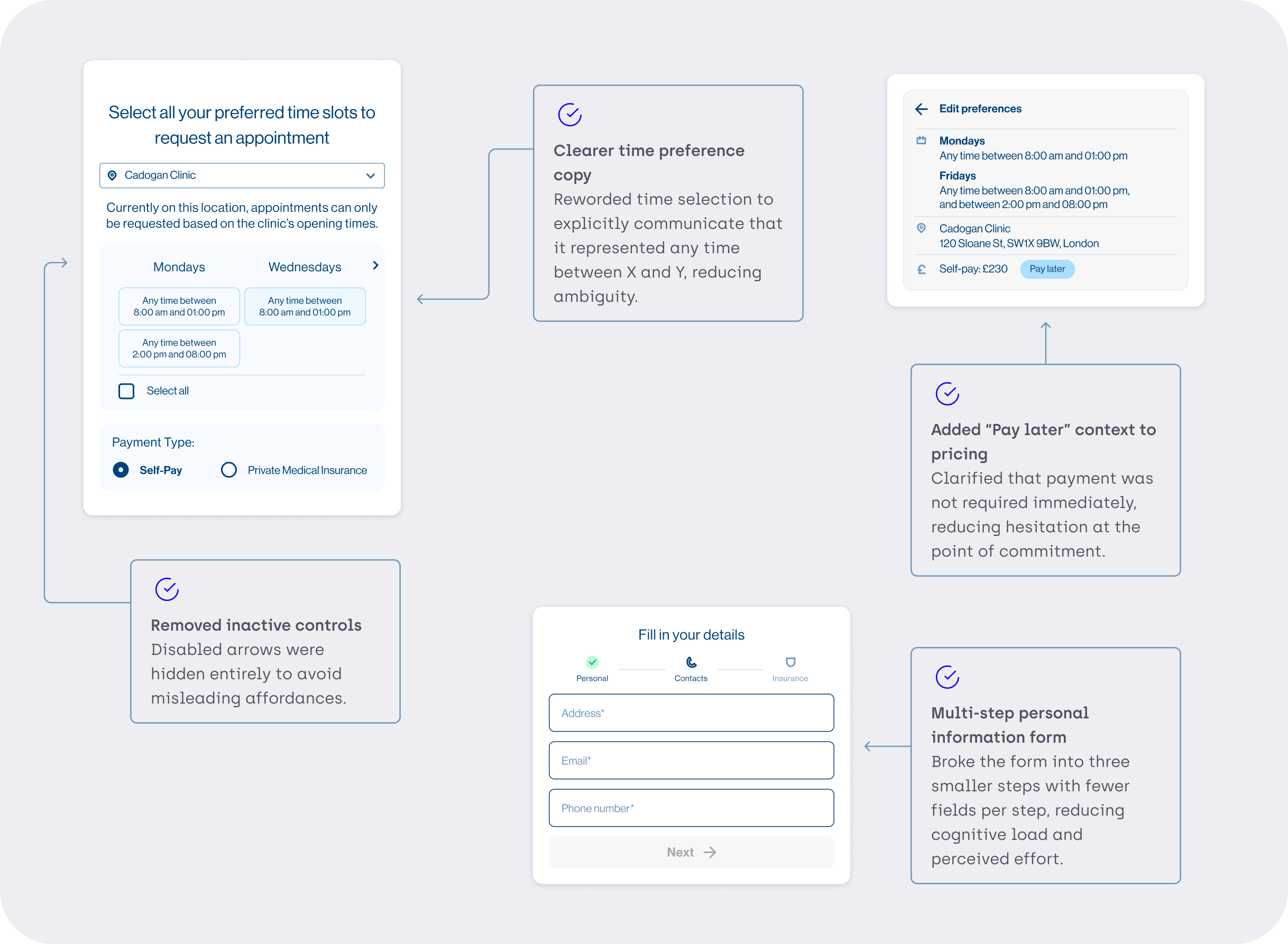
ITERATION 1
To address these issues, the following changes were introduced:
RESULTS & BEHAVIOURAL SHIFT
After the first iteration, new patterns emerged:
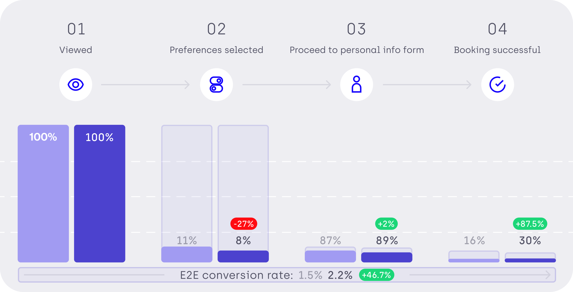
A drop between “widget viewed” and “time preference selected” Fewer users progressed initially, suggesting that clearer language helped users self-select more deliberately.
A +2% increase between time preference selection and form progression Users who did proceed were more confident and decisive.
A significant increase in successful bookings Overall booking conversion increased from 16% to 30%, nearly doubling completion rates.
Higher form completion rates, driven by reduced friction and clearer expectations.
KEY LEARNING